Final version of Interaction Project

Final version of Interaction Project
The subject of your web page:
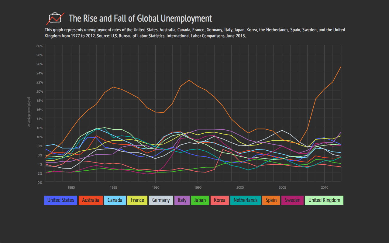
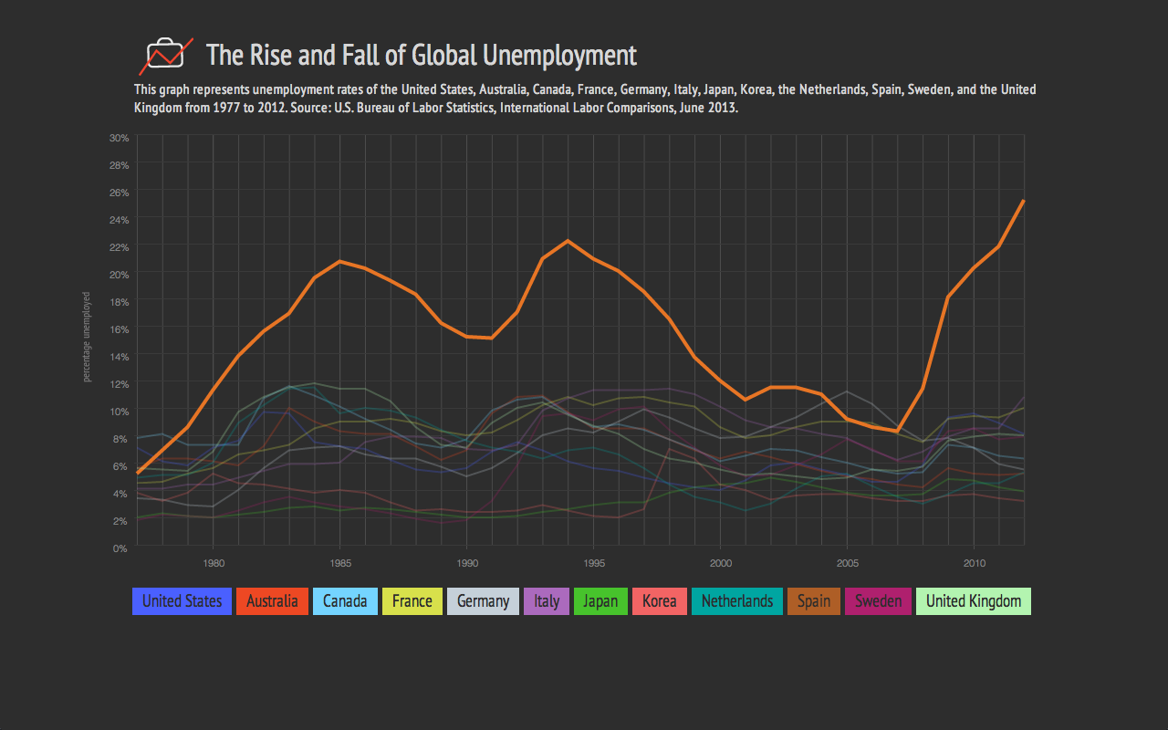
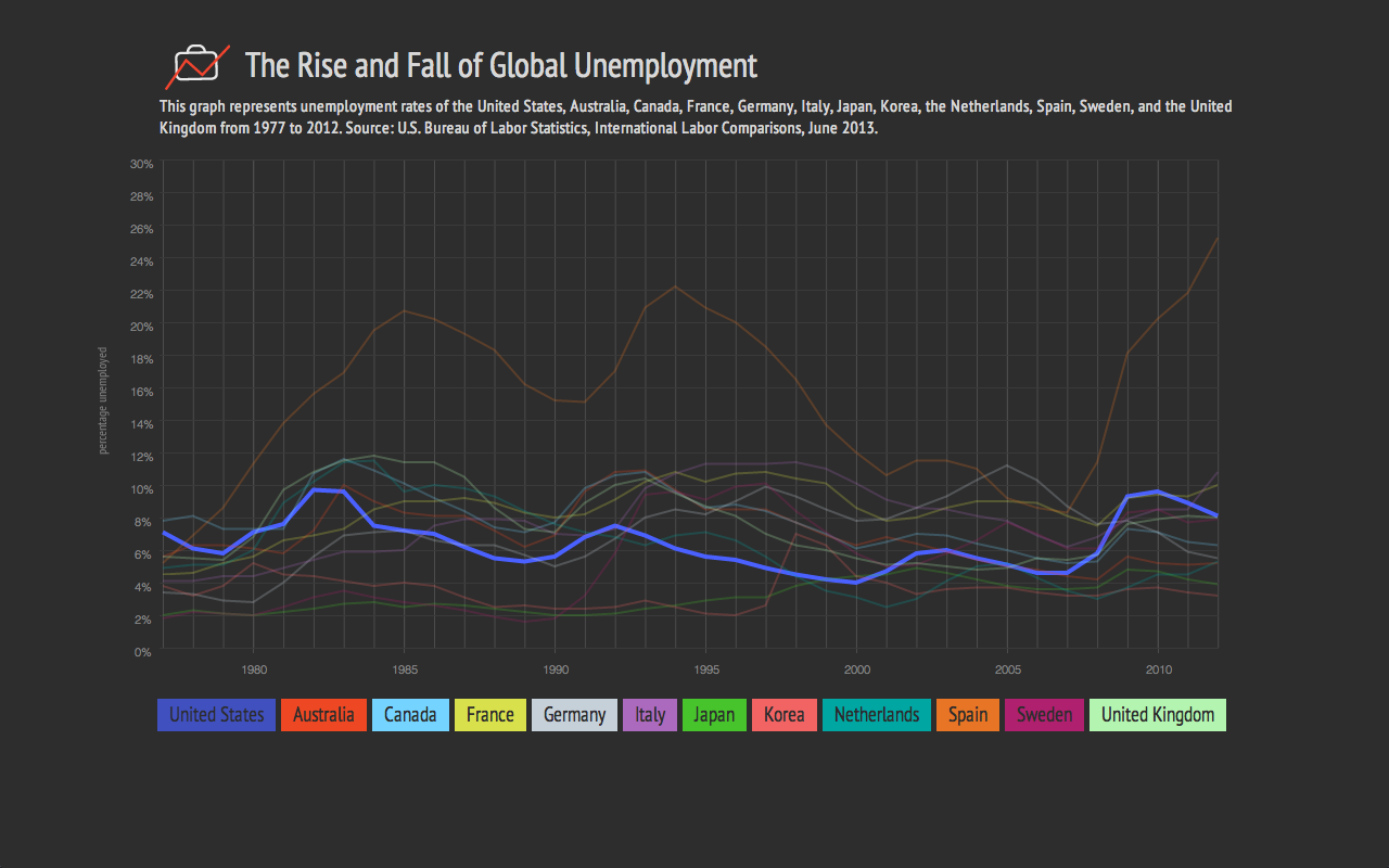
I’m interested in exploring global employment statistics and identifying employment trends through time. I’m going to present the data through a large line graph. The user will be able to click on a country of their choosing and that line in the graph will turn into an area graph and more detailed information about the selected country will appear below the menu of countries.
I’d like the user to then be able to click to see more detailed information on that specific country’s employment statistics, like unemployment numbers for men vs. women, unemployment numbers for different age groups, and the way the country’s economy is divided. It would be interesting to be able to compare one country’s unemployment numbers of women to another country’s.
The data you will use:
The data set is International Labor Comparisons from the Bureau of Labor Statistics from the United States Department of Labor. It is very detailed and shows employment data from 1970 to 2012 of the following countries: United States, Australia, Canada, France, Germany, Italy, Japan Korea, Mexico, Netherlands, New Zealand, South Africa, Spain, Sweden, Turkey and the United Kingdom.
The data set also includes employment statistics divided by different sectors of the economy (agriculture, industry, manufacturing, and services), as well as unemployment statistics divided by age group and gender. The excel file is very clear and easy to understand.
The technologies you will use:
I felt like I was getting more comfortable with javascript, but I worry about the timeline with this project. So, I think I will use processing for this project. I felt more comfortable with processing and think I could probably do more with animations and other transitions.
Identify and plan for every challenge.
Some of the data in the data set is not complete for some of the countries. However, I think I can get around that by either excluding those countries, or excluding earlier dates. Since Turkey, South Africa, and Mexico have limited data that was collected, I will likely exclude them from the visualization.
Challenges that I foresee:
Design Comp:
The subject of my web page:
I’m interested in mapping out Chicago Crime Statistics. I’m from the glorious city of Chicago and noticed a dramatic increase of crime over the last 5 years. I’m hoping that I may be able to come to some conclusions about the cause.
The data I will use:
The data set that I’m planning to use is provided by the City of Chicago to monitor chicago crime and is updated daily. The Chicago Tribune has created this API using these crime stats because the city of Chicago’s format is a little more difficult to use. The information that the API provides is the location (address, lattitude/longitude, neighborhood, ward), date, time, type of crime, description of crime, case number, whether there was an arrest, etc. The data is formatted into json, jsonp, xml, and csv.
https://data.cityofchicago.org/Public-Safety/Crimes-2001-to-present/ijzp-q8t2
http://blog.apps.chicagotribune.com/2013/03/22/announcing-the-chicago-crime-api/
My plan:
I plan to use Modest Maps (http://modestmaps.com/) to map out the city of Chicago. I will place a dot where each crime occurred. I’d like to have each type of crime mapped out on a separate map and will have a specific color dot correspond to a specific type of crime.
I’d also like to have a map that includes all types of crime so we can compare the different types and see which (if any) are more prevalent and in what areas.
A design comp of my visualization:
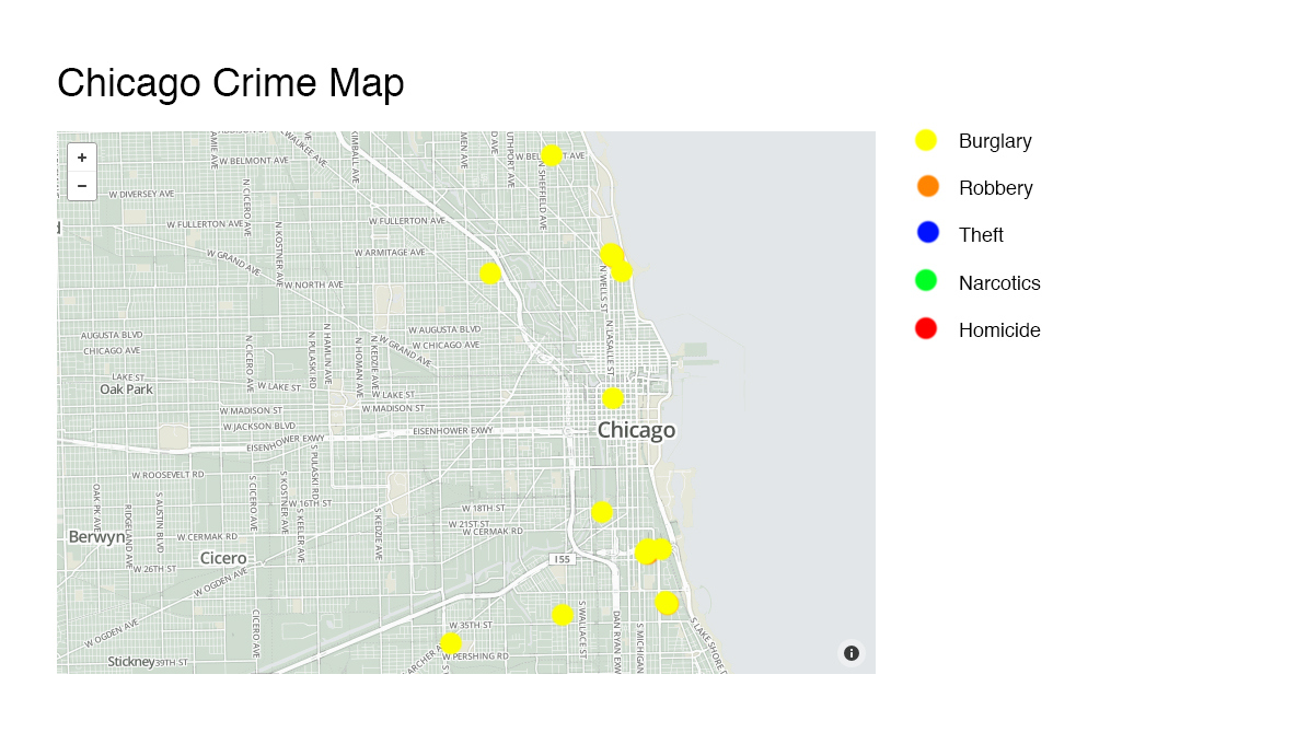
Map showing just the burglaries
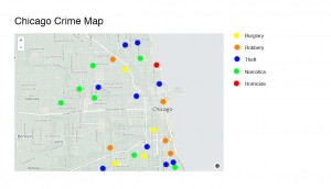
Map showing all types of crimes
Visualizations that Use Processing Presentation
In the Air
In the Air visualizes the different gases and particles in the air in Madrid at any given time. Sensors in the city produce hourly reports detailing particles in the air. The project aims to create a collective awareness of these particles so that eventually, local groups can create informed decisions on air quality regulation. There are additional In the Air locations in Santiago, Chile and Budapest, Hungary.
Flocking

Robert Hodgin’s Flocking uses processing to visualize the patterns that flocks of birds make while flying in groups.
Magnetic Ink

In Magnetic Ink, Hodgin uses the patterns he observed with the birds in flocking to show the same patterns represented in ink.
Similar Diversity
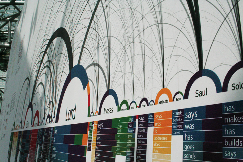
Similar Diversity is a visualization that visualizes the texts of Christianity, Islam, Hinduism, Buddhism and Judaism. Philipp Steinweber and Andreas Koller took the most common people mentioned in these works and lined them up horizontally across the x axis and the different verbs that are used with each person are lined up vertically below each person’s name. The goal of the work is to show the surprising similarity of each of these religions. It was created using vvvv and processing.
Travel Time Tube Map
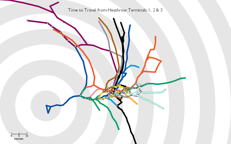
Tom Carden’s Time Travel Tube Map reconfigures the London Underground’s subway map based on the distance from a selected stop to all other stops.
City Symphonies
Mark McKeague noticed that the quiet nature of electric cars can be problematic when people cannot hear when other cars are nearby. In City Symphonies, he visualizes what it would be like to have cars emit different tones when they are close to other cars while driving.
We Feel Fine
In 2005 Jonathan Harris and Sep Kamvar wrote a program called We Feel Fine in which they collected information on every time a blog mentioned how a person was feeling. The program searches for the phrase “I feel …” every few minutes. Later, through a website, exhibition, and book, they showed the information they collected through their research. Each emotion is cataloged in many different ways – by the most common feelings, by age, by location, by weather, by holiday. The strongest pattern the project highlighted was that older people are often happier than younger people up until the age of sixty.
Dreamlines

After the user enters a few words, the program then draws an image with lines by piecing together different images from the internet to create the image of a dream world. Dreamlines uses PHP, Flash and Processing and was created by Leonardo Solaas.
Diana Lange

German visual artist, Diana Lange, takes a different approach to visualizing data. She maps out photographs by layering thousands of tiny lines and shapes on top of one another. Check out this article on her.
Diana Lange also visualizes poems.
Mike Brondbjerg

Similarly, Mike Brondbjerg re-visualizes famous portraits of US Presidents through processing. He also created an application so you too can create similarly styled images.
After having attended and worked at a number of universities across the country, it’s interesting to me how different a university’s student culture can be. I’m interested in exploring what factors contribute to crime at colleges and universities in the United States, and if there is any correlation between the geographic location of a university and the types of crimes being committed.
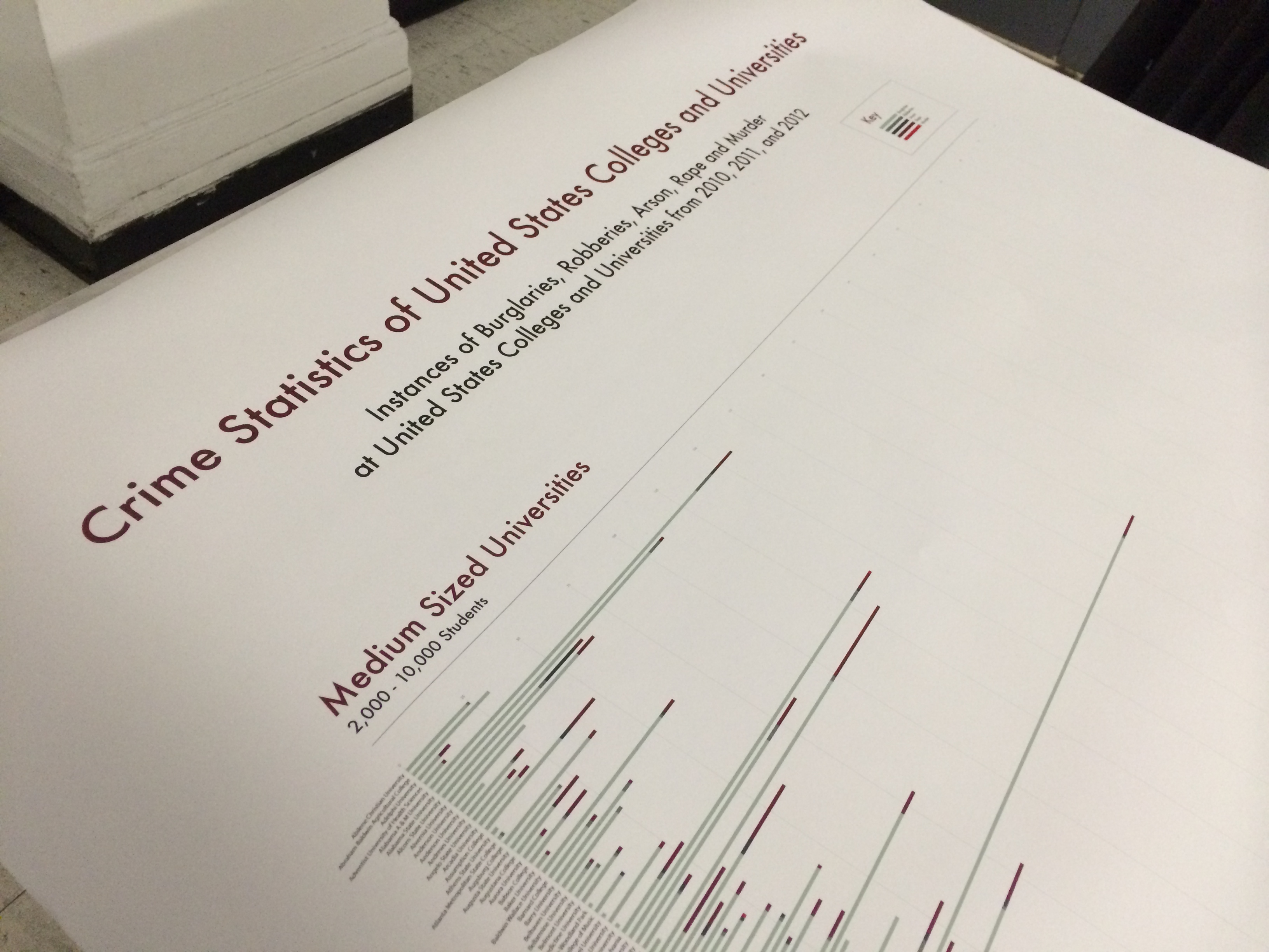
The data set that I chose is completely ginormous and has about 10,000 college campuses listed. I plan to include only 4-year colleges and universities . The information is broken down into many different categories, like murder, burglary, arson, robbery, etc., and I’d like to highlight each of these different categories for each university using a stacked bar chart and different colors to identify each category. Clearly, because each college has very different class sizes, I will need to calculate the percentage of each category.
I think it would be particularly interesting to highlight the different sorts of crimes that are most common and where (perhaps by state? or by colleges in rural areas vs. larger cities centers? or maybe even by rank?)
I plan to use Excel to format the data, Processing to create the initial graph, and then Illustrator to tidy everything up.
Data set: US Colleges and Universities Crime Statistics 2010-2012.
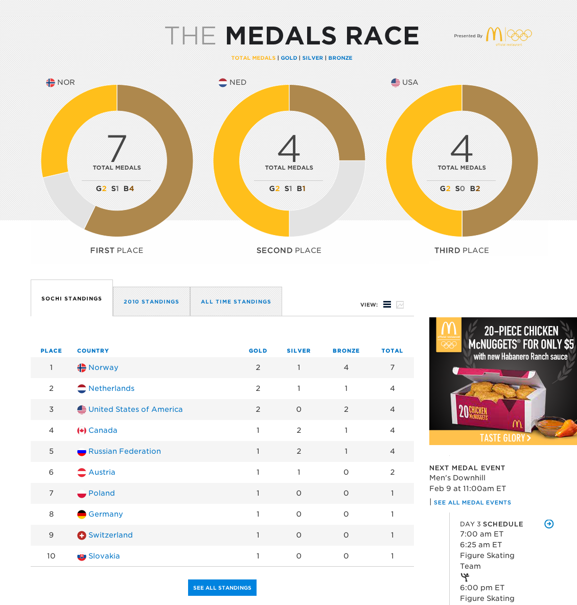
I have been watching the olympics and noticed that the site on the NBC website to keep track of the medals won is somewhat confusing and misleading. NBC uses three pie charts to show the percentage of gold, silver and bronze medals won by each of the top three winning countries. However, each pie chart is the same size, even when one country has many more medals. It is only the percentage of gold, silver and bronze that is depicted. So, especially at first glance, it seems that all three winning countries have the same amount of medals.
I’ve redesigned these graphics to show the number of gold, silver and bronze medals with three color-coded bar graphs. Then, below, I included a bar graph where each unit is represented by a medal graphic. This way, different countries can be easily compared and contrasted.
Here’s NBC’s design:
Click here to view the live version
(The data was from Sunday evening, 2/9)
And here is my design:
Data Visualization Aggregator – Information Aesthetics
Information Aesthetics is a collection of beautiful and interesting visualizations and discusses each one.
A Visualization – How Y’all, Youse and You Guys Talk
This visualization from the New York Times collects information on the user’s dialect and then maps out the areas that have the most similar and least similar dialects to the user.
Artist/Designer – Carlo Zapponi
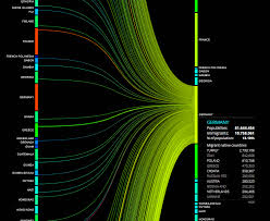
Carlo Zapponi is a visual designer in London who made “People Movin” which visualizes the number of people emigrating from each country in the world and where they are immigrating to.
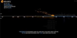
Another interesting visualization of Carlo Zapponi is called “Bolides,” which shows the number of meteors seen and recorded since 2500 BC. The visuals for Bolides are very compelling. As the visualization goes through time, small animated meteors fall onto the x-axis, representing each meteor that was recorded through time.
Visualization Tool – Modest Maps
Modest Maps provides very simple interactive maps that can be used for visualizations.
Data Collection Tool – Wrangler
Wrangler reformats messy data sets into organized tables and allows you to output the information into a variety of file formats.
Discussion Forum – Visualizing.org
Visualizing.org is an online community in which designers can discuss data visualization and showcase their own work.
Criticism – Mind the Gap – An Economic Chart Remake
Jon Schwabish of policyviz.com discusses ways in which he would improve a visualization that highlights the percentage of employed who are senior managers by gender. He provides a number of different examples that present the data in a more effective manner, including changing the orientation of the axes and the way that gender was differentiated.
Data Source – The World Data Bank
The World Data Bank has many collections of data including Gender Statistics, Health Nutrition and Population Statistics, and Education Statistics that are all accessible to anyone. Data can be filtered by country and date ranges.
Data Ethics – A Code of Ethics for Data Visualization Professionals
This article suggests that visual designer adhere to a “code of ethics” in which designers maintain an awareness of problems that may arise with visualizations they create. Designers should be aware of where their data is coming from, making sure that the sources are reliable. Designers should also be careful to correctly analyze the data and not make inaccurate assumptions. Finally designers should try their best to accurately portray the data and be open to criticism about their visualizations.
A Book – The Functional Art
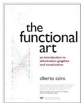
In The Functional Art, Alberto Cairo discusses what makes a data visualization particularly effective through a number of specific examples. He also talks about how and why people perceive and understand information they take in through data that is presented to them.