Location based Twitter sentiment analysis :
Location based Twitter sentiment analysis :
A dribbble visualizer – Bounce
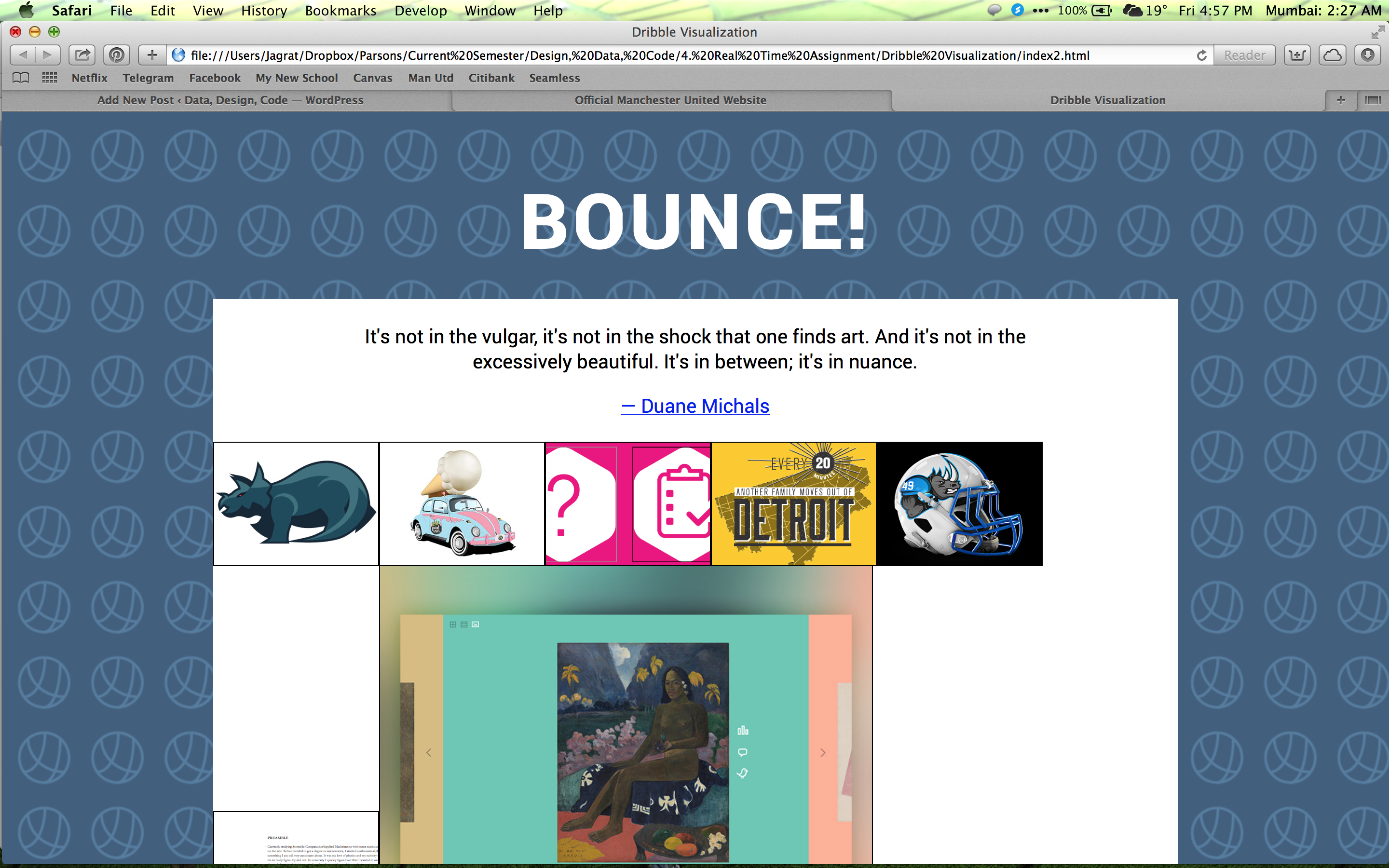
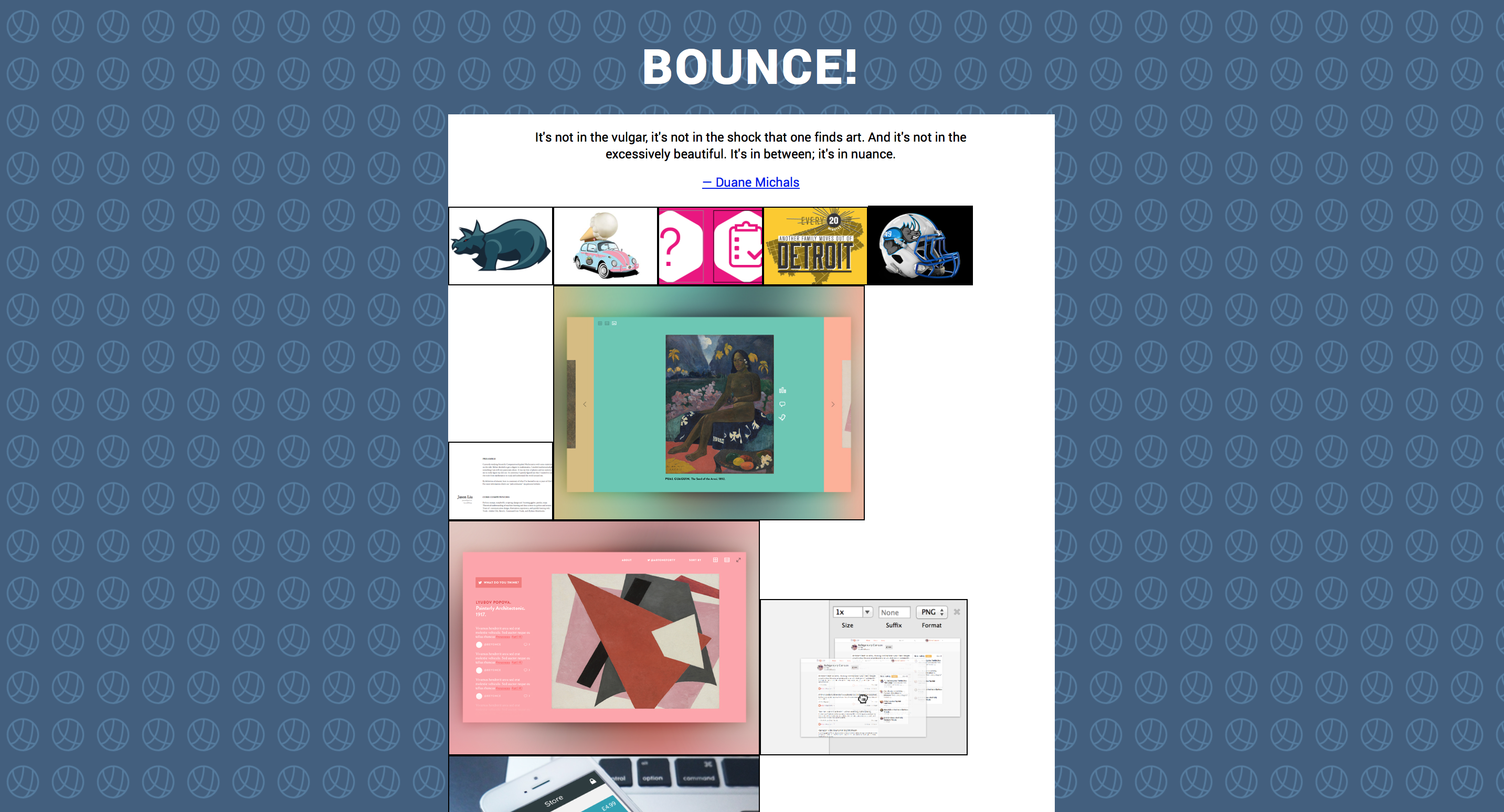
Purpose : To display Dribble artwork. The artwork will be displayed and sized according its popularity (more popular larger, less popular smaller), thus the data visualization will be made of the artworks itself. The popularity of an artwork changes frequently (at the least, daily).
Quotes on Design Resource page & API
Proposal :
Being a fan of soccer, I’m going to play around with soccer data & choose one of the following –
1) Compare betting odds to real outcomes of matches and if/how weather influences that.
2) Times it takes attackers to score their first goal after an injury.
3) Weather influencing violent behaviour on the field (measured by number of yellow and red cards)
——————————————————————
Data Source
——————————————————————
Tools Used
Website APIs & Processing

Data Visualization Aggregator
visual.ly followed by visualizing.org. (preferred visual.ly since it felt a little more vibrant than visualizing.org)
Visual.ly is website / collection of info graphics and data visualizations and is updated frequently. It’s like dribble but for info graphics.
Visualization
http://www.ted.com/talks/jonathan_harris_tells_the_web_s_secret_stories.html
In this TED talk, Jonathon Harris maps certain emotions gathered from data all around the world (on the internet) and looks at in relation to other variables like weather / day / gender etc.
Artist / Designer
Jonathon Harris
Visualization Tool
Processing.
From the tools I researched on, Processing seemed to be the most versatile and powerful. It allows you to take the visualization to almost any direction possible.
Data Collection Tool
Microsoft Excel
Due to its spreadsheet format, I think Excel is one of the best tools to view and re-arrange data.
Discussion Forum
I did not find a specific forum for Data Visualization, but there are many data visualization threads on various websites. These threads are usually either on websites that host tools for data visualization or websites that share data visualizations.
Data Source
As a whole, I think data.gov is a very useful data source because of its size. This followed by data from social networks, especially when coupled can be very useful.
Data Ethics
http://blog.visual.ly/a-code-of-ethics-for-data-visualization-professionals/
As much as it talks about it ethic, this article is also a guide to visualizing information in general. The cherry on top is the oath at the end of the article.
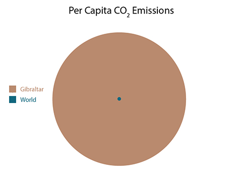
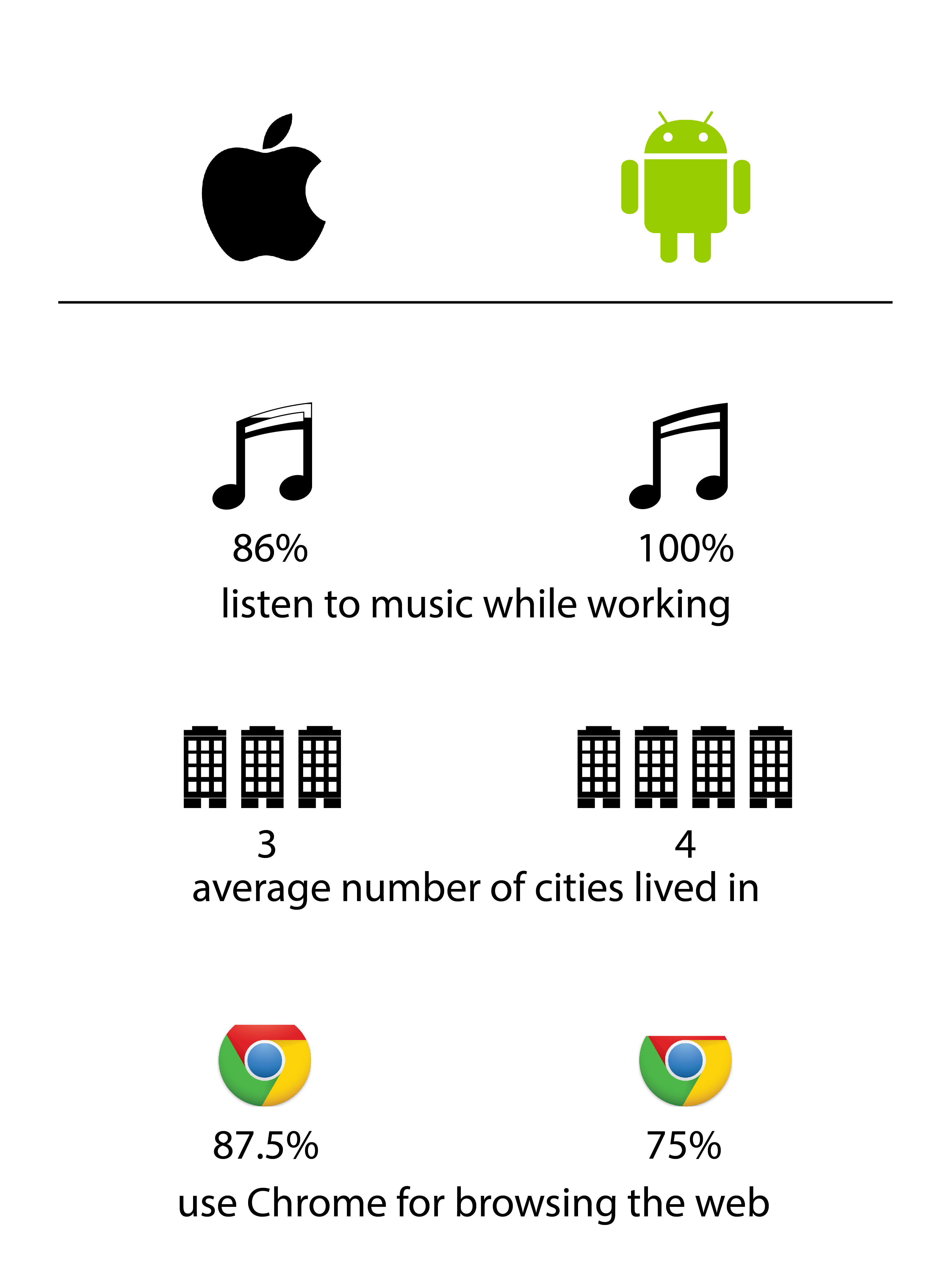
Instead of the original showing a comparison of countries, I thought it would be interesting to see a country compared to the world average.
Redesign :