Screenshot of my final project
Screenshot of my final project
My web page will be about weather. It will inform the viewers the weather of different cities around the world as well as give an approximate idea of the weather at first glance.
Weather Underground:
http://www.wunderground.com/weather/api/d/docs?d=data/conditions&MR=1
My visualization will be a world map that will be made up of circles/dots that represent the states around the world. Through the API I have access to the longitude and latitudes of each state, and the size of the circle/dot will be based relatively on the size of the state. I will categorize temperatures in ranges, and each range will be represented by a color. Hence at first glance, the viewer can examine the similarities of temperature around the world (something like a heat map). When the viewer clicks on the dot, exact information of that state will be shown, which will include the state name, country, exact temperature at that time, and temperature range.
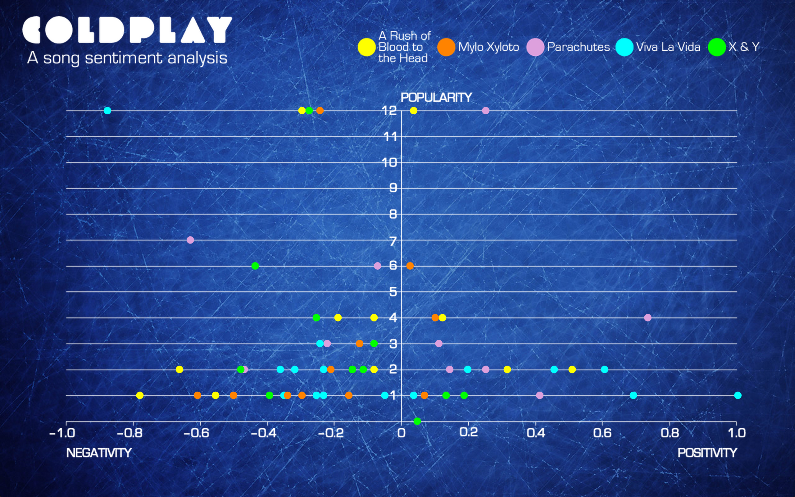
Title: Everything you need to know about Dexter!
Topic: Dexter (aired on showtime).
Dexter is a serial killer, but also a blood spatter analyst at Miami Metro Homicide. Hence, I portrayed my data through blood spatters.
Each blood spatter represents an episode. There are 8 seasons with 12 episodes each. The x-axis of the blood spatter represents the order of the episodes, the y-axis represents the user ratings on a scale of 1-10, and the size of the spatter represents the number of victims in each episode.
In the show, dexter analyses blood spatter through thread work which helps him get closer to how the murder took place. Hence, all the victims are connected to Dexter. Also, some characters of the show played important roles in specific seasons. Those characters are connected to the respective season as well.
Each season has one major antagonist on whom the story revolves, so to depict them I illustrated icons that represent each season. Lastly, I also included each episode name, as they have symbolic importance to each season.
The presentation of my data is inspired by Dexter’s ‘kill room,’ and so exists three-dimensionally.


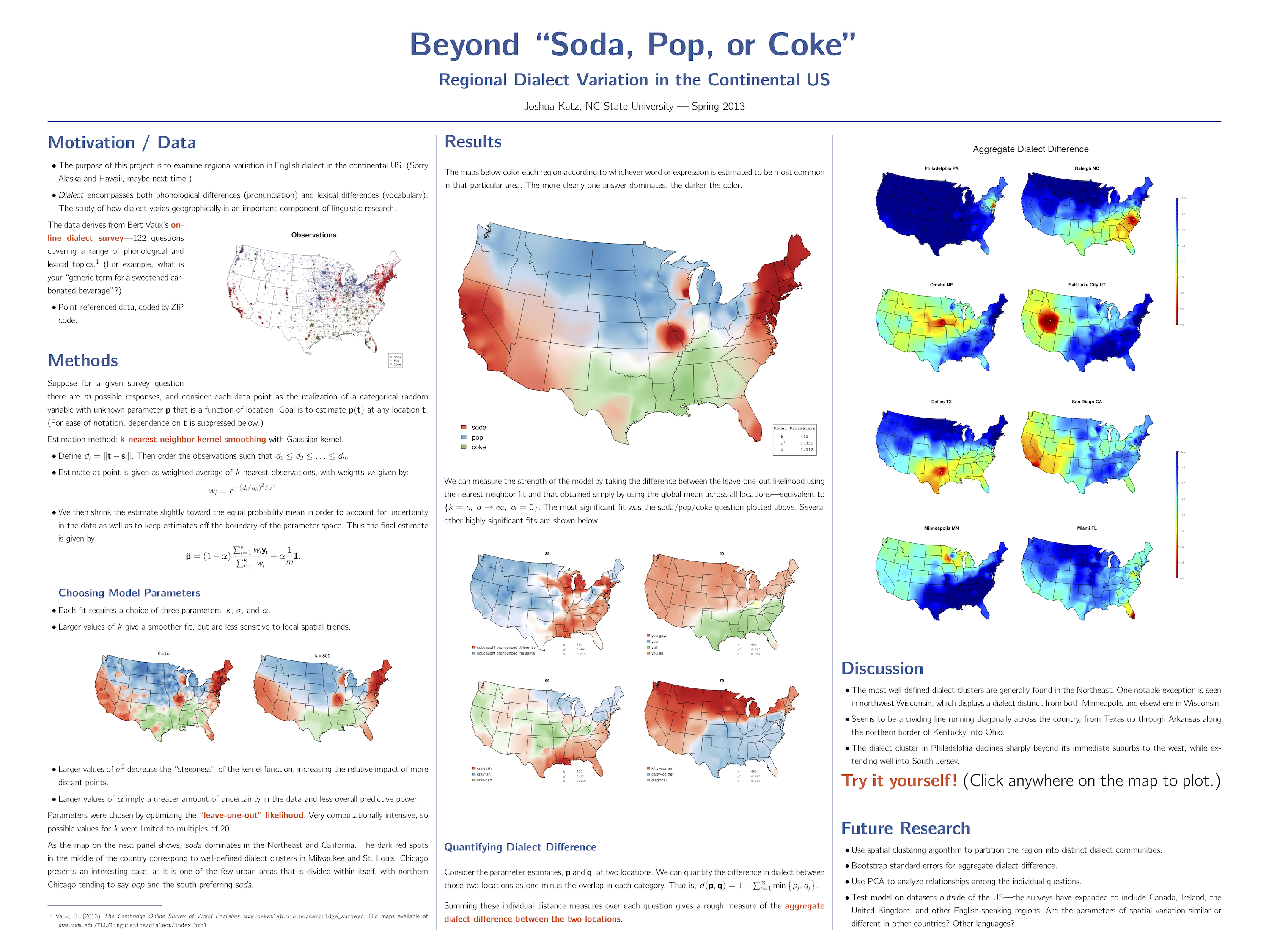
Presentation Topic: Dialect Survey Maps (A visualization)
These dialect maps were made by Joshua Katz based on data from the Harvard Dialect Survey and were conducted by Bert Vaux and Scott Golder.
They examined regional dialect variation in the United States. Each observation can be thought of as a realization of a categorical random variable with a particular parameter vector that is a function of location—their goal was to interpolate among these points in order to estimate these parameter vectors at a given location, making use of a combination of kernel density estimation and non-parametric smoothing techniques. Results in a smooth field of parameter estimates over the prediction region. Using these results, a method for mapping aggregate dialect distance was developed.
Video of people taking the survey
What does the way you speak say about where you’re from? See your personal dialect map here
I am a big fan of the TV show Dexter that aired on Showtime. I wanted the subject of my poster to relate to Dexter, and make my visualization a sort of collectible for Dexter fans. The purpose of the poster will be to inform viewers, showing them different data in categories about the show over their 8 seasons (96 episodes).
I will be showing:
The name of each episode
Air date of each episode
Names of victims per episode
Names of major victims per season
Viewer ratings per episode
Main Cast per season/episode
Writers per episode
Directors per episode
I will be using pre existing data from different sources. The links to which are as follows:
The name of each episode
Air date
Names of victims per episode
Names of major victims per season
Viewer ratings per episode
Main Cast per season/episode
Writers per episode
Directors per episode
Link to previously existing data visualization:
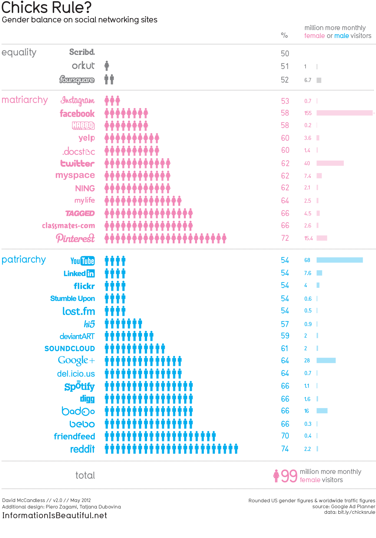
Chicks Rule? (Information is beautiful)
Redesign of the above data visualization:
Preview:
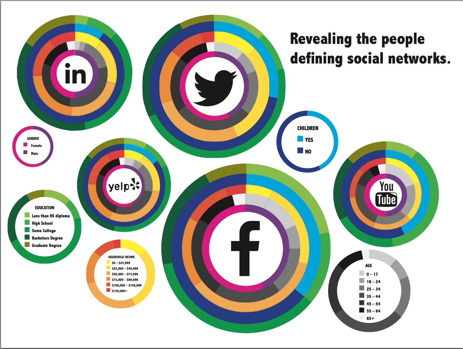
PDF Document:
Vanshika_Swaika_Week2_Data Redesign
Write Up:
The data visualization I chose gives information about gender based use of social networking sites. The design makes it clear at first glance that it is gender associated but I was confused by the number of stick figures for each gender along with the bar that associated the million more users. Also, after reading the data source I realized that the visualization displays false data. Overall I felt that if this visualization illuminated some more data on specific social networks instead of just gender based use on so many networks, it would be more effective.
Hence, for my redesign I chose the most popular social networks out of the data provided, and decided to display more data about those specific networks. My aim behind my design was to not only display meaningful data but also make it visually compelling.
http://datavisualization.ch
http://spark.rstudio.com/jkatz/SurveyMaps/
Stamen is a design and technology studio in San Fransisco that builds maps and data visualizations.
Visually’s mission is to help create visual content that rises above the noise. Their platform seamlessly connects designers, journalists, animators and developers with clients, featuring cloud-based collaboration tools that allow them to deliver high-quality content at unprecedented scale and speed.
Numbers has everything you need to organize data, perform calculations, and manage lists. And you can do it all with just a few taps on any apple device.
A discussion of the best data visualizations of 2013.
A blog that discusses info graphics and data visualizations.
InfoChimps is an organisation that has developed a data supermarket. The platform hosts over 15.000 datasets from 200 different organisations and companies. Visitors can use these datasets to combine them with their own datasets for additional insights.
News of data breaches and mortgage applicants being categorized as “risky” when inaccurate credit info and commercial demographic profiles are merged has finally made consumers aware of data mining.