Data Visualization Aggregator – Information Aesthetics
Information Aesthetics is a collection of beautiful and interesting visualizations and discusses each one.
A Visualization – How Y’all, Youse and You Guys Talk
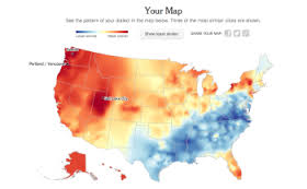
This visualization from the New York Times collects information on the user’s dialect and then maps out the areas that have the most similar and least similar dialects to the user.
Artist/Designer – Carlo Zapponi
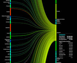
Carlo Zapponi is a visual designer in London who made “People Movin” which visualizes the number of people emigrating from each country in the world and where they are immigrating to.

Another interesting visualization of Carlo Zapponi is called “Bolides,” which shows the number of meteors seen and recorded since 2500 BC. The visuals for Bolides are very compelling. As the visualization goes through time, small animated meteors fall onto the x-axis, representing each meteor that was recorded through time.
Visualization Tool – Modest Maps

Modest Maps provides very simple interactive maps that can be used for visualizations.
Data Collection Tool – Wrangler
Wrangler reformats messy data sets into organized tables and allows you to output the information into a variety of file formats.
Discussion Forum – Visualizing.org
Visualizing.org is an online community in which designers can discuss data visualization and showcase their own work.
Criticism – Mind the Gap – An Economic Chart Remake
Jon Schwabish of policyviz.com discusses ways in which he would improve a visualization that highlights the percentage of employed who are senior managers by gender. He provides a number of different examples that present the data in a more effective manner, including changing the orientation of the axes and the way that gender was differentiated.
Data Source – The World Data Bank
The World Data Bank has many collections of data including Gender Statistics, Health Nutrition and Population Statistics, and Education Statistics that are all accessible to anyone. Data can be filtered by country and date ranges.
Data Ethics – A Code of Ethics for Data Visualization Professionals
This article suggests that visual designer adhere to a “code of ethics” in which designers maintain an awareness of problems that may arise with visualizations they create. Designers should be aware of where their data is coming from, making sure that the sources are reliable. Designers should also be careful to correctly analyze the data and not make inaccurate assumptions. Finally designers should try their best to accurately portray the data and be open to criticism about their visualizations.
A Book – The Functional Art
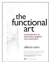
In The Functional Art, Alberto Cairo discusses what makes a data visualization particularly effective through a number of specific examples. He also talks about how and why people perceive and understand information they take in through data that is presented to them.