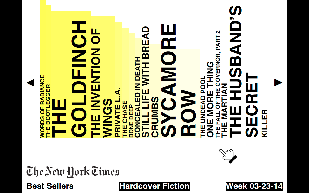
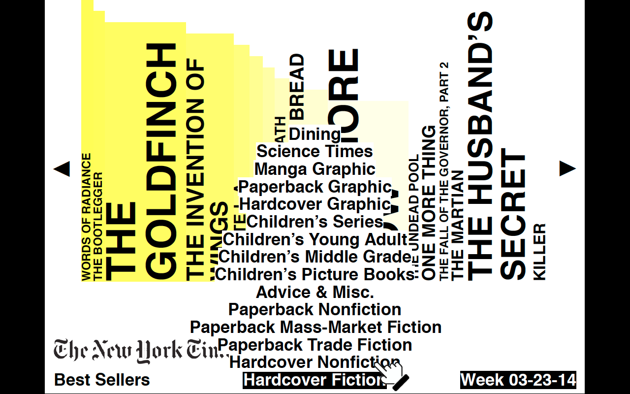
My webpage will show the New York Times Best Sellers list (updated weekly)
Link to data source documentation: http://developer.nytimes.com/docs/best_sellers_api/
The Best Sellers website at http://www.nytimes.com/best-sellers-books/overview.html approaches their data by…
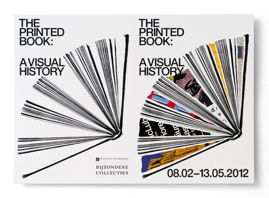
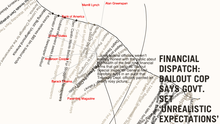
Inspiration image: ‘The Printed Book’ by Experimental Jetset
 And others:


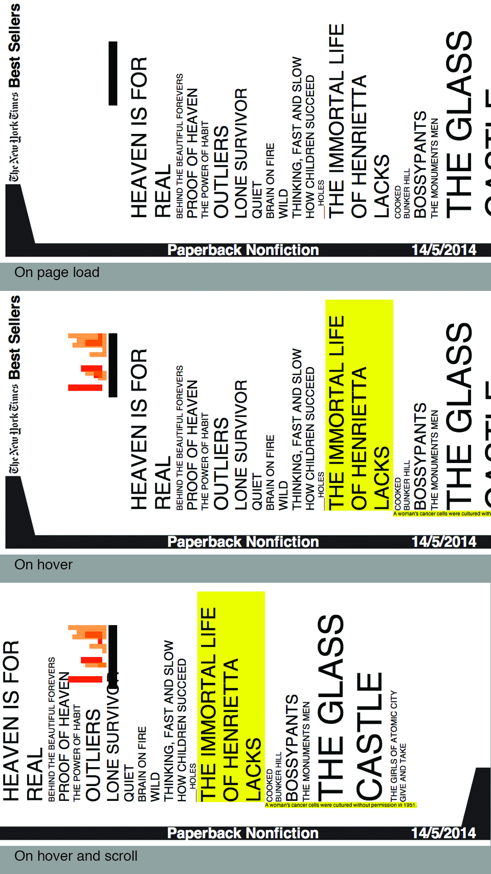
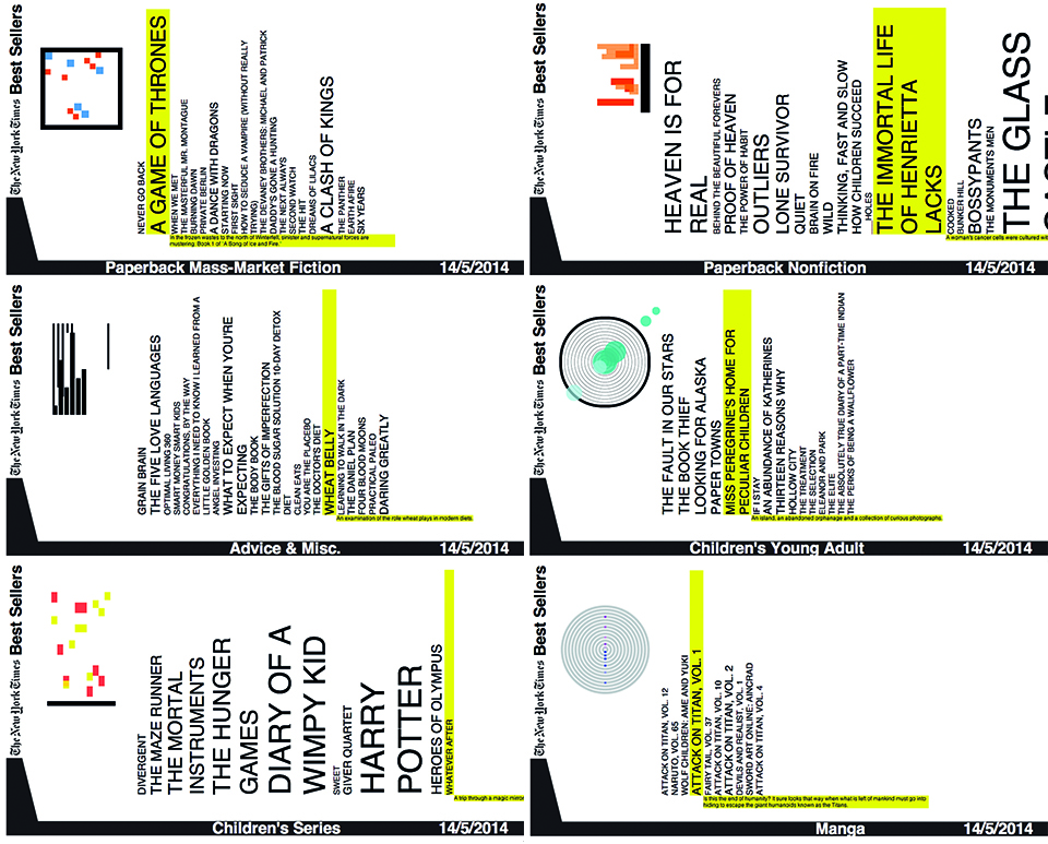
Initial proposal:

realtime_proposal_1 – bookshelf, archival, Helvetica
Week – shown at bottom-right, scroll horizontally to see past/future weeks
Genre – choose from menu at bottom-centre
Ranking (1-15) – left to right, diminishing yellow highlight
Number of weeks spent on the list – font size (1 week at 18pt, 20 weeks at 72pt)
Info – displayed when mouse hovers over a book
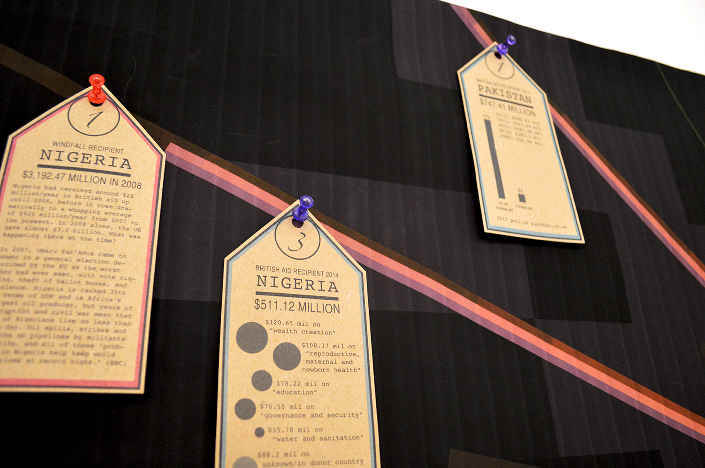
UK foreign aid, 1962-present
There are over 200 countries over a span of more than 50 years, accounted for in this data visualisation.
Each country that currently receives aid from the UK is depicted by a red bar and its half overlapping pink bar. Each country that has received UK aid in the past is represented by a green bar. The longer the bar, the more aid received in a single year, and for each country some 50 translucent bars are layered over each other to give a condensed depiction of aid received by that nation since 1962. The pink bar, however, represents the amount of aid received in 2014 alone.
To slightly relieve the viewer from the abstraction of the central visualisation, the tags highlight the most significant data, aided by simple infographics, background information and/or points of contention :


What do you want to show? Why? What about your data is interesting?
I want to show UK foreign aid spending, suggesting that it should be cut (unless continued research changes my mind on the debate which I doubt).

On airplanes you’re told to “secure your own oxygen mask before assisting others”. At a time when everyone is harping on about the economy and how the budget deficit was at GBP 85.1 billion (fiscal year 2012-13), it seems nonsensical to be aiming to spend GBP 11.3 billion/year in foreign aid. It is likely a race to be the first of the G8 to meet the 0.7% of GDP target promulgated by the UN. Critics ask how much of that money is lost in translation or wasted…does foreign aid encourage sustainable development? Most statistics only tell us about the short-term fixes (vaccinations, school supplies etc.) Many are also unhappy that middle-income countries are receiving money through multilateral aid set up by the EU and UN agencies. Justine Greening, the international development secretary said:
“You only have to look at business generated by China and India to see the potential they provide for UK companies as their export markets continue to develop.”
Yet, after the launch of India’s first spacecraft to Mars through their $1 billion space program, their finance minister Pranab Mukherjee said that aid from the UK (280 million GBP/year) was:
“…a peanut in out total development expenditure.”
And the UK will continue to “aid” India till 2015. WHAT IS THE POINT? WHAT IS LIFE? Not to mention that the UK sells weapons to third world countries on the regular which hardly puts their focus on development. Oh the irony.

How will this translate into a data visualisation? What data are you using?
My main visualisation, built with code (Processing), will depict this dataset showing UK foreign aid spending from 1960-2009: https://docs.google.com/spreadsheet/ccc?key=0AonYZs4MzlZbdGY4VXR1RmRkY0dOUG9jejNEM0JNaEE&hl=en#gid=0
And this one from 2010-2015 (proposed): https://docs.google.com/spreadsheet/ccc?key=0AonYZs4MzlZbdHlLaVZaWjlsbHExVmpnbU41ZDJhYmc&hl=en#gid=0
I then intend to pick out interesting areas for smaller complementary visualisations/graphs:
I am using data collected by The Guardian (UK) newspaper to show that their schmaltzy disposition can’t override the common sense that data screams. Their articles come with downloadable data sets. Some articles already feature simple graphs/data visualisations which will aid my understanding.
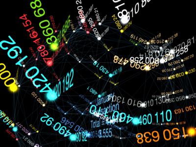
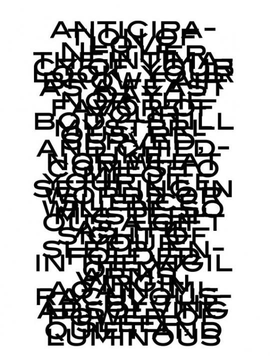
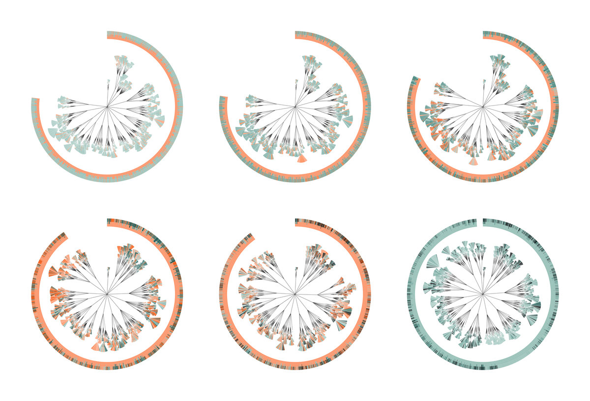
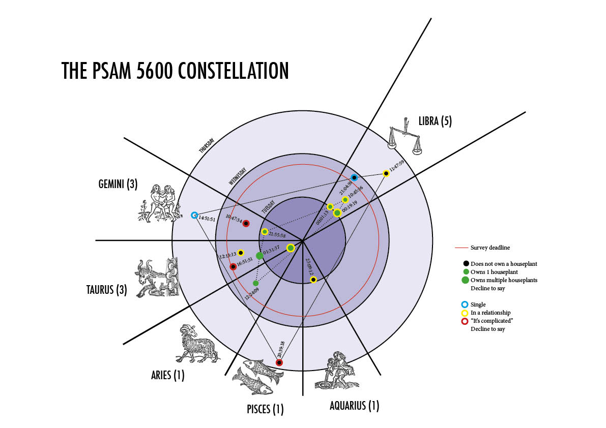
Visual inspiration
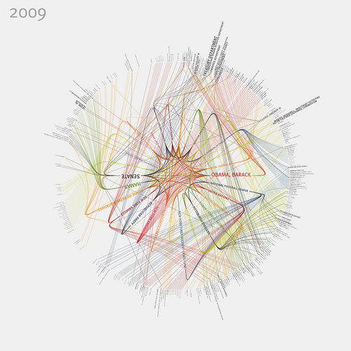
I imagine the main visualisation to be circular and complex, with the accompanying smaller graphs to be varied and sprouting off the main frame like weird growths. I kind of want it to look ludicrous to reflect the information.
The data visualisation I chose was from the New York Times, for the article Dissecting a Trailer: The Parts of the Film That Make the Cut. Five of the ‘Best Picture’ nominees from last year’s Academy Awards were compared, showing which parts of the film were cut for the trailer. I chose the data visualisation for Argo.
Data shown: overall run time, length of each clip, and from which moment in the film the clips are taken.
 The visualisation is well designed and informative. The sheer number of cuts and the way the graph jumps up and down suggests that the movie is fast paced and engaging. However, no graph is going to look better than the actual trailer, so for my redesign I took each tiny cut and showed the actual version. The width of each slither is more or less proportional to the amount of screen time it has, so 1cm in width = approximately 1 second of screen time.

My visualisation eliminates the original concept of beginning/middle/end, and concentrates on conveying the choppy ‘thriller’ nature of the film. The glimpses of eyes, fists, and faces shows the film’s very character-based plot and overall human sensibility. Antithetically, all the small snippets of living data made it feel very mechanical and statistical which is why I presented it as part of a script or paperwork of some kind, rather than a glossy feature film poster.
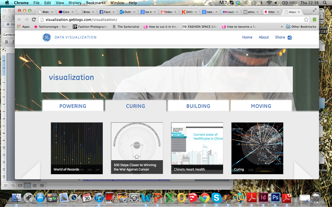
Date visualisation aggregator: GE (General Electric) believes that “data visualization is a powerful way to simplify complexity.” They display their creations under four sections: powering, curing, building and moving. http://visualization.geblogs.com/visualization/
A visualisation: made with Processing, the notes of a ballad played on the piano acts as the data used in the moving visualisation. http://www.diana-lange.de/portfolio/generative/balladen/balladen.html#navi
A designer: formerly the Data Artist in Residence at the New York Times, Jer Thorp has also been published in the Guardian and The New Yorker among others. He sometimes teaches at NYU and runs his own workshops from his studio in Brooklyn. On his website he shares source code and tutorials (Processing and ActionScript2), using his own visualisations as examples. http://blog.blprnt.com/about
TED talk: Jer Thorp – ‘Make Data More Human’ http://www.ted.com/talks/jer_thorp_make_data_more_human.html
Visualisation tool:
Data collection tool: a ton of sites and programs with which you can import and format data. http://www.visualisingdata.com/index.php/2013/09/essential-resources-tools-for-collecting-and-handling-data/
Discussion forum: over 7,000 questions regarding Processing are asked and answered by the online community. http://forum.processing.org/one/programming-questions/1.html
Criticism: “Data Visualization: It’s Pretty, but Is It Useful?” http://blogs.guggenheim.org/lablog/data-visualization-its-pretty-but-is-it-useful/
Data source: a ridiculous number of links to a huge variety of sites which hold subject-specific data e.g. government, social media, newspapers, mapping etc. http://www.visualisingdata.com/index.php/2013/07/a-big-collection-of-sites-and-services-for-accessing-data/
Data ethics: 2011 iOS tracking ‘scandal’ http://arstechnica.com/apple/2011/04/senator-questions-apple-in-wake-of-ios-tracking-scandal/
A book: ‘Interactive Data Visualization for the Web’ by Scott Murray teaches you to write code (html/css/D3). Other books in the series include guides for Python and more. Found at McNally Jackson (52 Prince Street, New York 10012). http://www.amazon.com/Interactive-Data-Visualization-Scott-Murray/dp/1449339735/ref=sr_1_1?s=books&ie=UTF8&qid=1391300328&sr=1-1&keywords=Interactive+Data+Visualization+for+the+Web
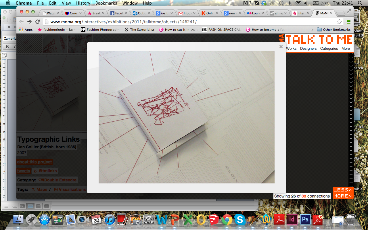
Exhibition: MoMA’s ‘Talk To Me’ (July-Nov 2011) exhibits contemporary artists and designers’ takes on communication and networking. Not all works deal with data, but some of those that do show how data visualisations aren’t limited to the screen.