All posts by Radhika Biyani
New Proposal
Interactive Proposal Assignment
Realtime Assignment Proposal
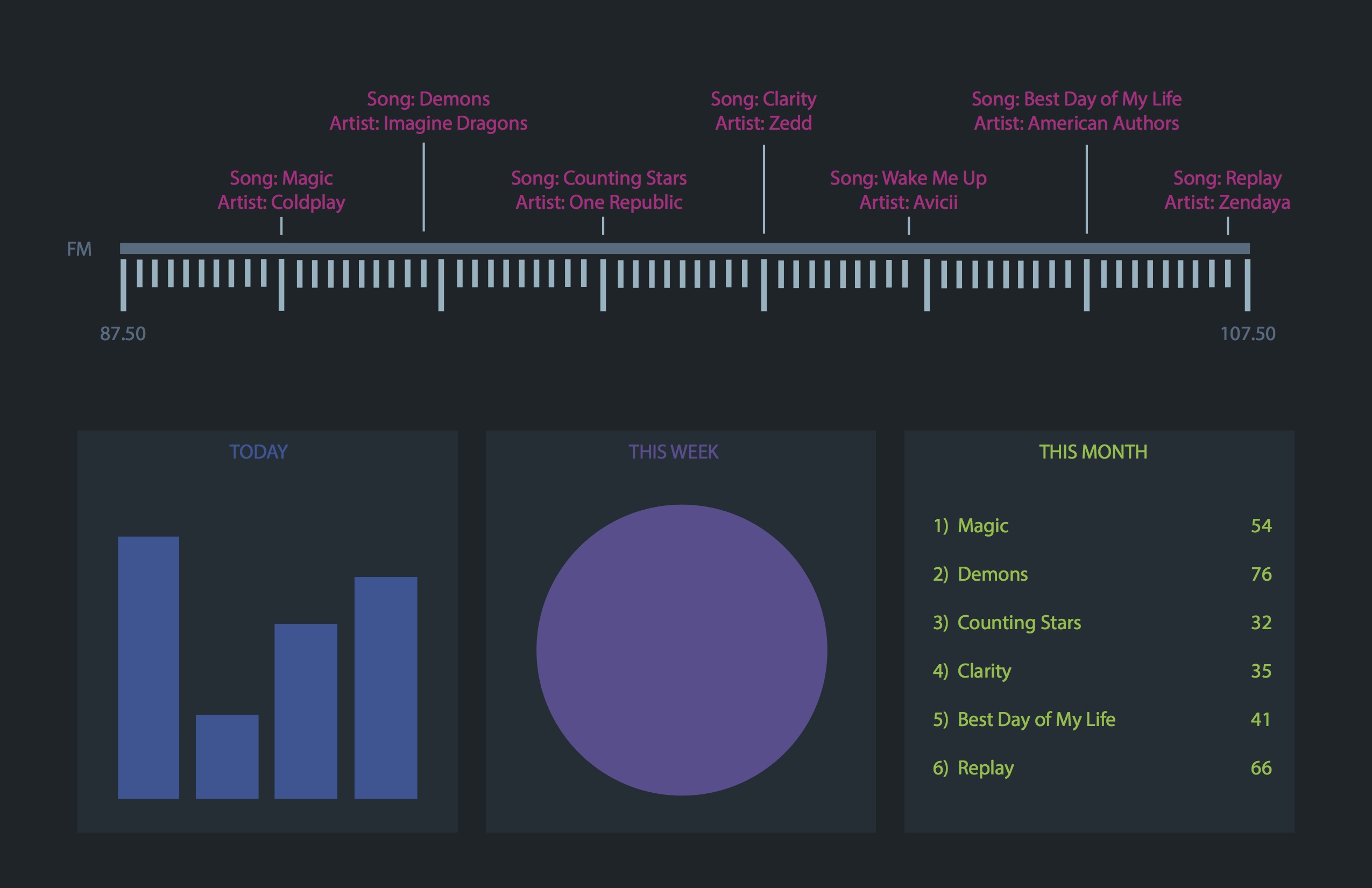
- Realtime Update of FM Radio Stations of New York City
This website will show all radio stations of New York and what they are playing at that point in time. The visualization will also update daily, weekly and monthly charts indicating the top played songs and their frequency within that time period.
- YES API
This data source gives real time updates of most US radio stations. http://www.programmableweb.com/api/yes-broadcast-db
- Visualization Example

Little Big Data Assignment
Visualizing DJ MAG Top 100
This visualization is designed in the form of a periodic table that show stye Top 100 Dj’s of 2013 as rated by DJ Mag. The ‘periods’ in the table are categorized according to countries that the DJ’s belong to while the color coded tabs indicate Genre. The ‘Noble gases’ are essentially countries that have either just one or two DJ’s who made it to the top 100.

Little Big Data Proposal
Since I really like EDM (Electronic Dance Music), I want to visualize the top 100 DJ’s of the world using the data from 2013 DJ Mag top 100. These results post around September – October every year and are based on popularity. People across the world vote for their favorites and the results tend to be a big deal for DJ’s themselves.
I would show some of the following data:
– Rank
– Change in Rank from 2012
– Genre
– Best known for
– Tune of the year
– What age they started their career
– Their age right now
– Origin
– Actual name vs. Stage name
etc.
Tools I would use:
Excel ( Advanced)
Processing (Beginner/Just learning)
Illustrator (Advanced)
Redesign Assignment

http://visual.ly/how-much-your-body-worth-black-market
I chose to redesign the above info graph. I most importantly wanted to change the title since it does not justify the information as well as filter some of the information that did not fit well. I also wanted redesign the illustrations to make it simpler and easier to interpret.
My Redesign:
Survey Assignment

Research Assignment
- Data Visualization Aggregator
http://visual.ly
Visual.ly is a great website solely dedicated to data visualizations. Users can upload, share and get inspired by its vast library of visualizations.
- A visualization
http://www.partselect.com/JustForFun/Appliance-Repair-Replace-Infographic.html
This particular info graph is one of my favorites. It is an interactive one with a very simple and beautiful layout . It allows the user to hover over each appliance and compare replacement and repairing costs.
- Artist/Designer
http://www.columnfivemedia.com
Column Five Media is a company that has offices in New York and California. They do a variety of visualization works including motion graphics and interactive info graphs.
- Visualization Tool
https://gephi.org
Gephi is an open source visualizing software that can be used for various purposes. Gephi is however best for dynamic network analysis. I have myself used it to visualize my Facebook social network.
- Data Collection Tool
http://nomi.com
Nomi is a New York based startup that allows it’s clients to collect data of their customers in order to gain valuable insight. One of their clients are Baked by Melissa.
- Discussion Forum http://www.visualizing.org
A website that allows creative participants to collaborate and design data visualizations.
- Data Source http://www.flightradar24.com/data/
A real time data website that gives information on flights and airports.
- Data Ethics http://blogs.hbr.org/2014/01/big-datas-dangerous-new-era-of-discrimination/
This particular blog post on Harvard Business Review has some very interesting points and discussions.
- A Book
http://www.informationisbeautiful.net/books/
Information is beautiful is one of my favorite websites and book. I have read the UK version though.