NeoPixel Rings running the Adafruit strandtext NeoPixel example code.


NeoPixel Rings running the Adafruit strandtext NeoPixel example code.
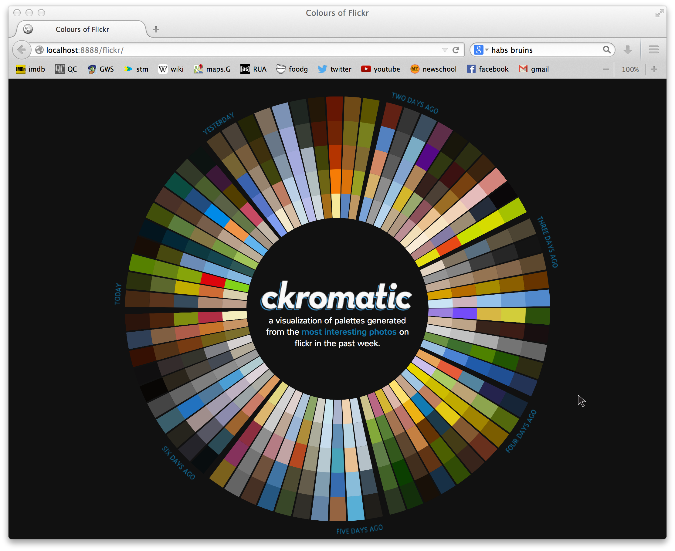

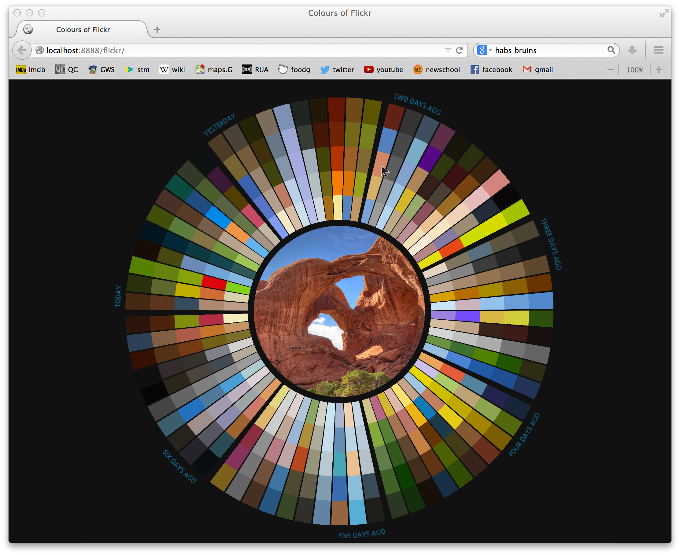

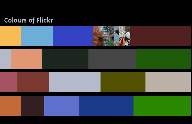
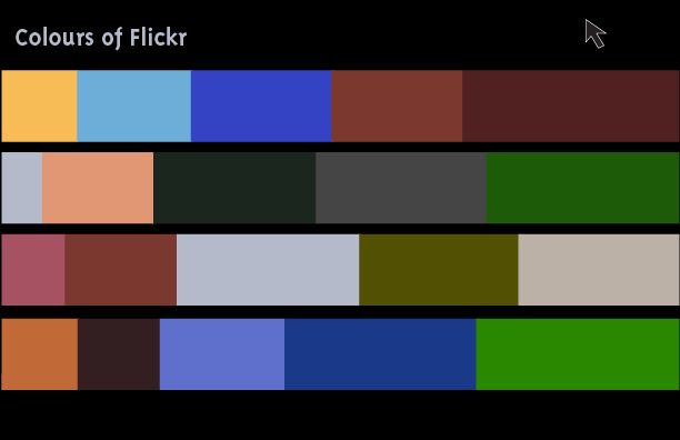
The Flickr Interestingness algorithm tracks the most interesting photos on Flickr by parameters such as “where the clickthroughs are coming from; who comments on it and when; who marks it as a favorite; its tags and many more things which are constantly changing.” Having a high “interestingness” factor is what gets a photo to the Explore page, which means more views and a higher chance of appearing in external search results.
I would like to look for and visualize the colour trends of these most interesting photos.
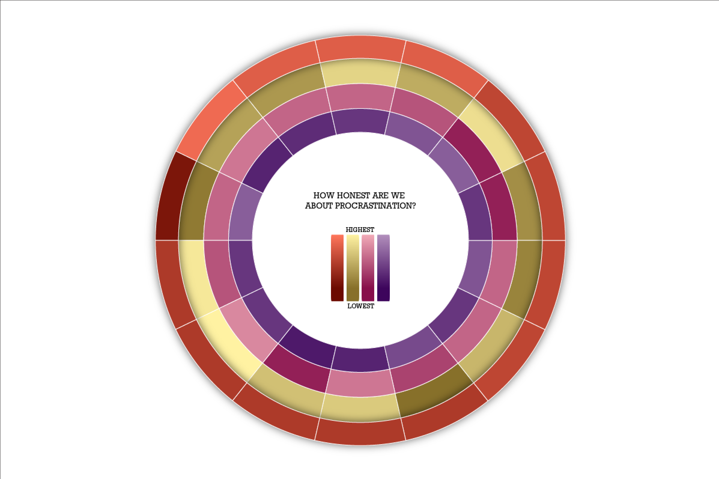
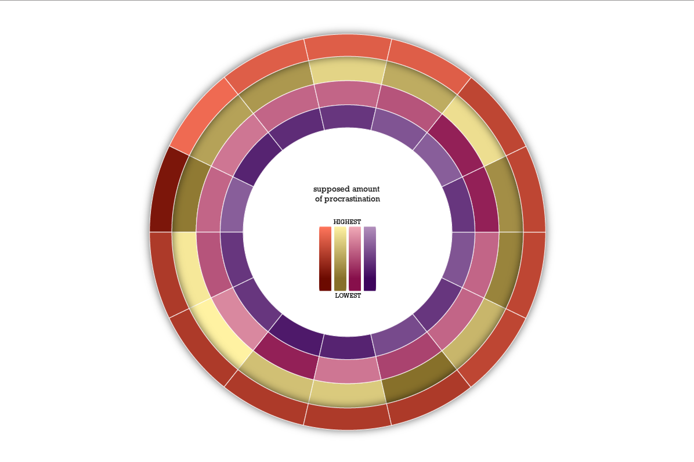
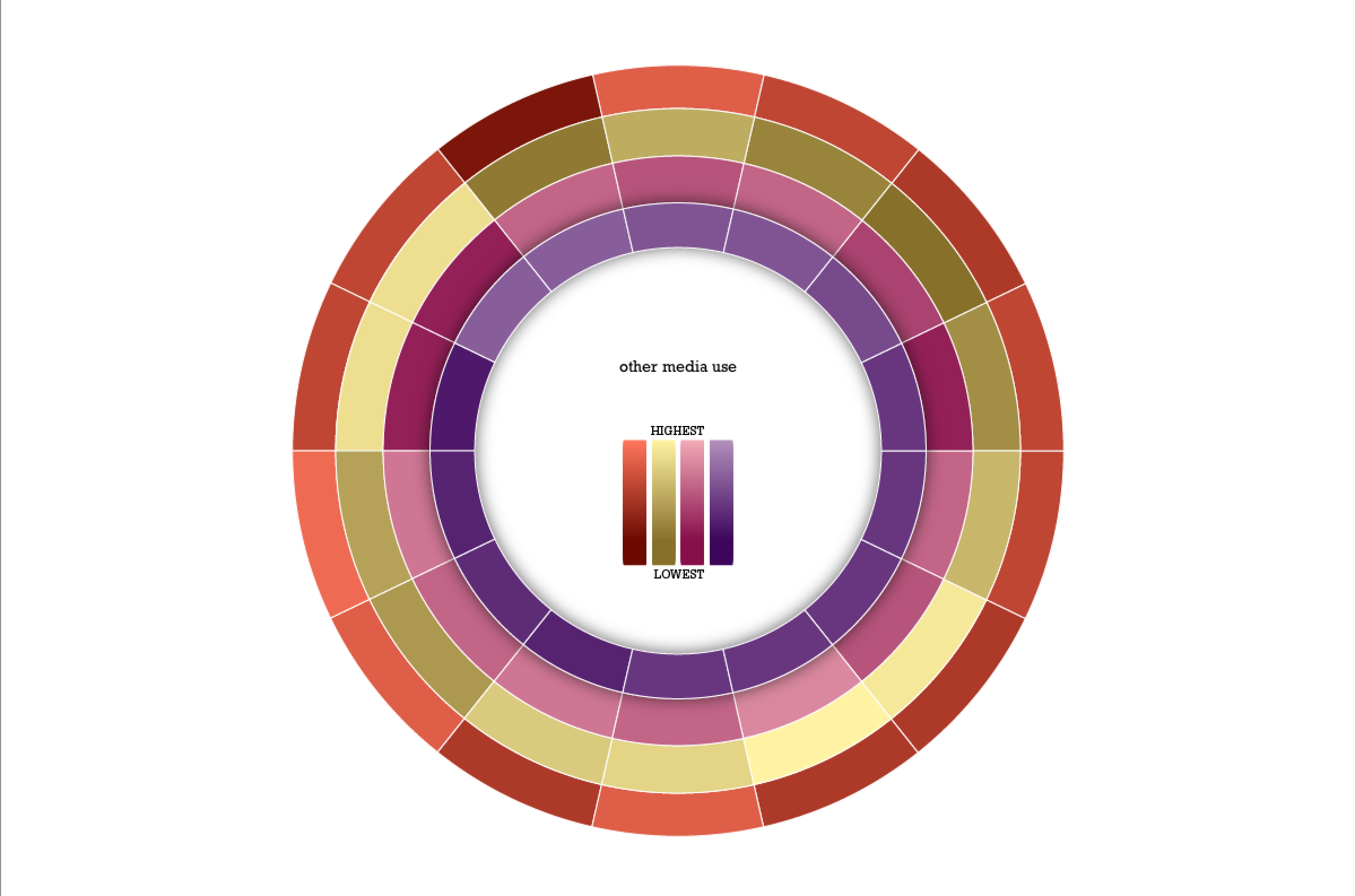

I tried to show how honest we were about our procrastination by comparing the level we rated ourselves (1-10) and how much we use social and other media.
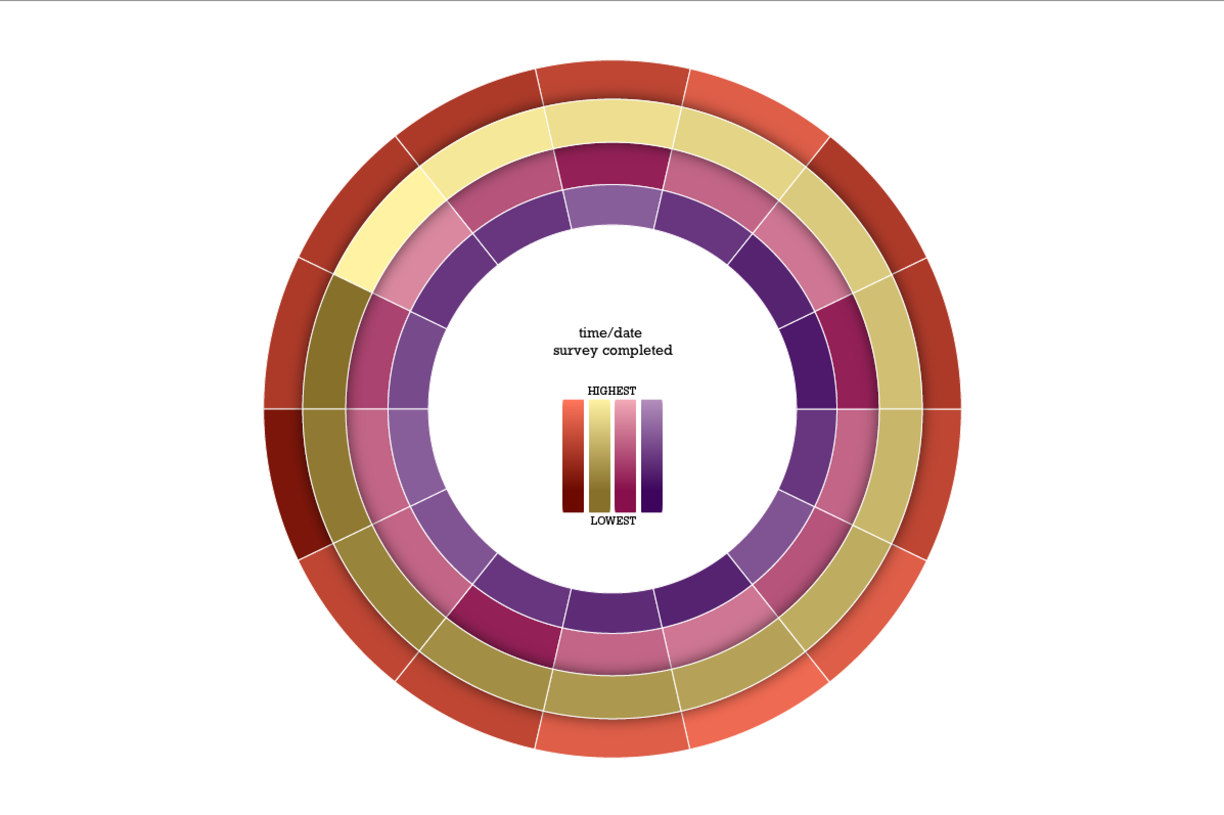
Can be rearranged interactively.
How much markup is there between what farmers are payed (¢/lb US) and what we pay? Are things getting better or worse for farmers? Is Fairtrade certification actually helping? The Fairtrade Foundation doesn’t actually monitor markup prices for retailers, so ideally I want to find out (approximately) what percent of our money actually reaches the farmers themselves, by comparing these retail averages to price per pound at grocery stores, Starbucks, Dunkin Donuts, etc, in the States.
DATA SOURCE
The International Coffee Organization has data of retail prices by country, and prices to 54 different growing countries going back to 1990.
&
Fair Trade USA
Impact reports and financial information.
TOOLS
Processing: “advanced.”
Original
http://visual.ly/pot-smokers-why-are-they-skinny
Redesign

The visualization I redesigned posed the question “why are pot smokers skinny?” and never answered it. It didn’t even try to answer it, really. It just went on about the gender, ethnicity, marital status, etc of the people involved without much attention to why they are thin, or if they even are. According to waist circumference stats at the bottom, they aren’t even thinner than the other groups. Additionally, the age-group of 30-32 year olds were missing, and according to the numbers 1000 more people answered that category than answered the survey as a whole.
Data Visualization Aggregator
http://www.visualcomplexity.com/vc/
“The project’s main goal is to leverage a critical understanding of different visualization methods, across a series of disciplines, as diverse as biology, social networks or the World Wide Web.” A site with many neat data visualizations.
A Visualization
http://www.upworthy.com/heres-a-fact-about-sharks-and-humans-thatll-stay-with-you-every-hour-on-the-hour-today
Sharks don’t kill people; people kill sharks. () Upworthy’s not usually my favourite, but I came across this on the Facebook page of a shark loving friend, and unsustainable fishing is bad. Also, this one on other fish we eat but shouldn’t. http://infobeautiful3.s3.amazonaws.com/2013/01/1276_Which_Fish_2013.png
Artist/Designer
http://alignedleft.com/
Scott Murray. A self declared “code artist,” specializing in data visualization, generative art and designed experiences with the goal of getting people to slow and down and take a closer look at things.
Visualization Tool
https://github.com/jagracar/grafica
The grafica library for Processing. Helps create 2D plots/graphs. Includes features that allow you to zoom/pan around your visualization (“make your data move!”), and add/display labels with ease.
Data Collection Tool
http://vis.stanford.edu/wrangler/
Wrangler, from Stanford U. Puts your un-charted data into tables for you, but you’ll probably learn more if you do do it yourself..
Or really anything else from this lovely list by ComputerWorld: http://www.computerworld.com/s/article/9215504/22_free_tools_for_data_visualization_and_analysis
Discussion Forum
http://www.reddit.com/r/visualization/
Reddit’s r/visualization. Discussions on coding visualizations, mostly. Additionally r/dataisbeautiful has more examples and is generally prettier, but r/visualization is more helpful. r/learnprogramming could be handy as well.
Criticism
http://www.theguardian.com/news/datablog/2013/jul/24/why-you-should-never-trust-a-data-visualisation
An article that speaks against trusting data visualization at all, claiming it’s biased to the creator. The author claims that things like this http://www.washingtonpost.com/blogs/worldviews/wp/2013/05/15/a-fascinating-map-of-the-worlds-most-and-least-racially-tolerant-countries/ are widely accepted as objective fact, and how that’s a problem. Pretty much a less funny version of the house hippo argument (http://www.youtube.com/watch?v=NBfi8OEz0rA).
Data Source
http://www.cdc.gov/nchs/surveys.htm
Center for Disease Control and Prevention. Has many surveys/data sets related to health and diseases. Not the clearest site and/or data sets, but there’s a bunch of stuff on here if the topics interest.
https://explore.data.gov/ethics/
Or the US Govenrment data site. Search anything. I searched “POTUS” and got a list of White House visitor records. Select viewtype>datasets.
Data Ethics
http://www.technologyreview.com/news/424104/what-big-data-needs-a-code-of-ethical-practices/
What Big Data Needs: A Code of Ethical Practices. The author writes about how everything can be/is tracked in our lives both on and offline. And this was two years before the whole Snowden thing.
A Book
http://http://www.amazon.com/Best-American-Infographics-2013/dp/0547973373/
Best American Infographics 2013. Technically infographics, clearly, but some of them fall into the data vis category. Can be found at The Strand for $17.95 (or Amazon $6 less plus all the fun carbon emissions, etc. from shipping it directly to your door). Some very pretty visualizations on a variety of topics.