Visualizations that Use Processing Presentation
In the Air
In the Air visualizes the different gases and particles in the air in Madrid at any given time. Sensors in the city produce hourly reports detailing particles in the air. The project aims to create a collective awareness of these particles so that eventually, local groups can create informed decisions on air quality regulation. There are additional In the Air locations in Santiago, Chile and Budapest, Hungary.
Flocking
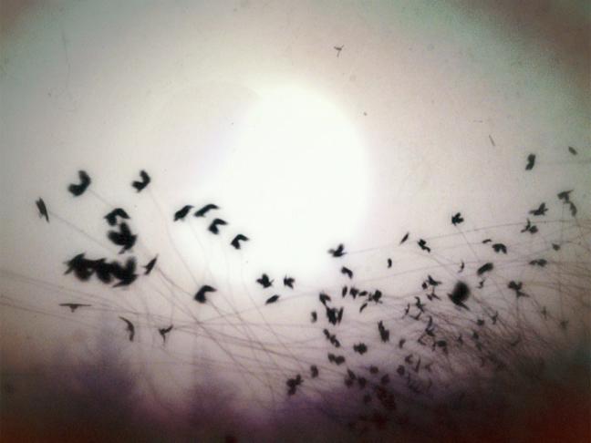
Robert Hodgin’s Flocking uses processing to visualize the patterns that flocks of birds make while flying in groups.
Magnetic Ink

In Magnetic Ink, Hodgin uses the patterns he observed with the birds in flocking to show the same patterns represented in ink.
Similar Diversity
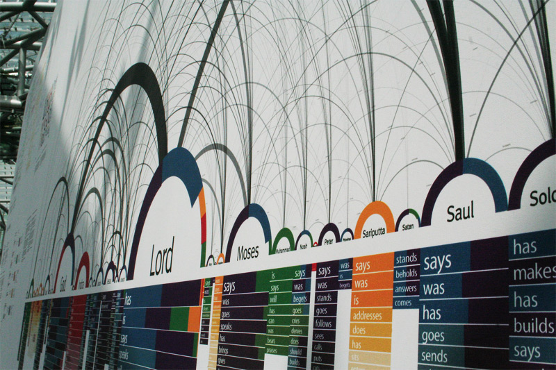
Similar Diversity is a visualization that visualizes the texts of Christianity, Islam, Hinduism, Buddhism and Judaism. Philipp Steinweber and Andreas Koller took the most common people mentioned in these works and lined them up horizontally across the x axis and the different verbs that are used with each person are lined up vertically below each person’s name. The goal of the work is to show the surprising similarity of each of these religions. It was created using vvvv and processing.
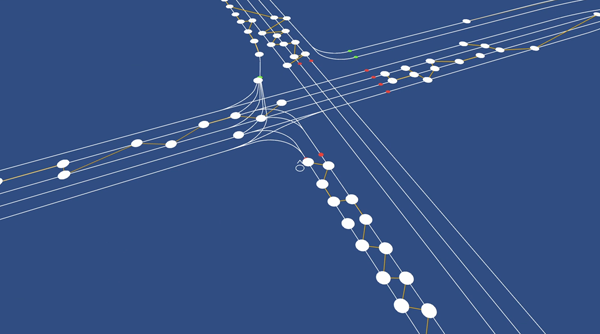
Travel Time Tube Map
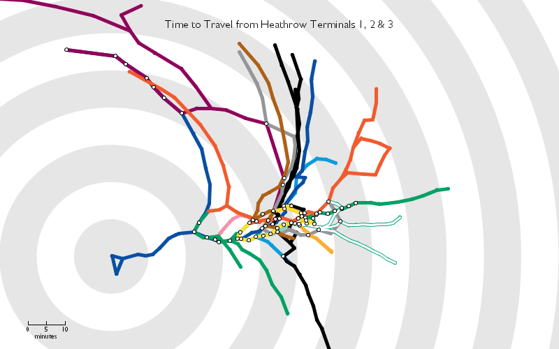
Tom Carden’s Time Travel Tube Map reconfigures the London Underground’s subway map based on the distance from a selected stop to all other stops.
City Symphonies
Mark McKeague noticed that the quiet nature of electric cars can be problematic when people cannot hear when other cars are nearby. In City Symphonies, he visualizes what it would be like to have cars emit different tones when they are close to other cars while driving.
We Feel Fine
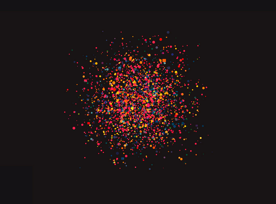
In 2005 Jonathan Harris and Sep Kamvar wrote a program called We Feel Fine in which they collected information on every time a blog mentioned how a person was feeling. The program searches for the phrase “I feel …” every few minutes. Later, through a website, exhibition, and book, they showed the information they collected through their research. Each emotion is cataloged in many different ways – by the most common feelings, by age, by location, by weather, by holiday. The strongest pattern the project highlighted was that older people are often happier than younger people up until the age of sixty.
Dreamlines
After the user enters a few words, the program then draws an image with lines by piecing together different images from the internet to create the image of a dream world. Dreamlines uses PHP, Flash and Processing and was created by Leonardo Solaas.
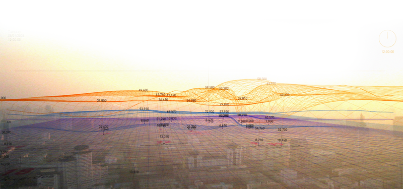
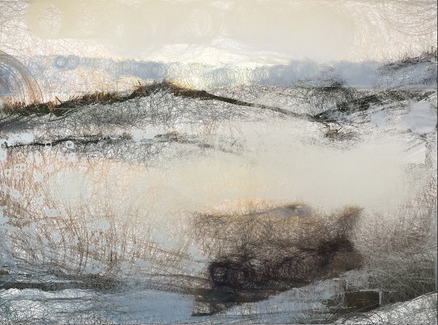
Diana Lange

German visual artist, Diana Lange, takes a different approach to visualizing data. She maps out photographs by layering thousands of tiny lines and shapes on top of one another. Check out this article on her.
Diana Lange also visualizes poems.
Mike Brondbjerg
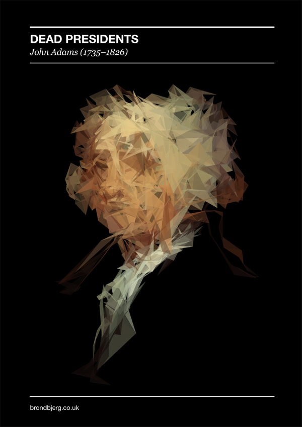
Similarly, Mike Brondbjerg re-visualizes famous portraits of US Presidents through processing. He also created an application so you too can create similarly styled images.