All posts by Cody

Research: Personal Data Visualizations

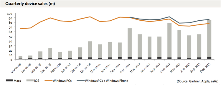
Researching Personal Data Visualizations quickly pulls one into the realm of the Quantified Self, the growing population that wishes to track every aspect of their lives. This includes nutrition intake, steps walked, elevation climbed, locations visited, distance traveled, and so forth. It’s also become a growing field of extensive research since it has many implications for the medical industry, productivity in the workplace, and commercial engagement.

Chloe Fan at Metromile details why it is important to keep the actual visualization simple, despite the complexity of the collection of data or the amount of data collected.

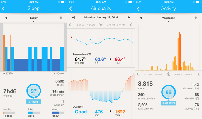
As a small case study, I will be comparing the companion application interfaces for different personal tracking devices, limited to step/distance counting and sleep tracking.

Misfit Shine

Shine

Misfit breaks down the information collected over the day and breaks it into a series of tiles based on different activities. The tiles can get cluttered in a day with a variety of activity/motion, and the clean symmetry makes their chronology a little bit muddled.

Jawbone UP

Jawbone

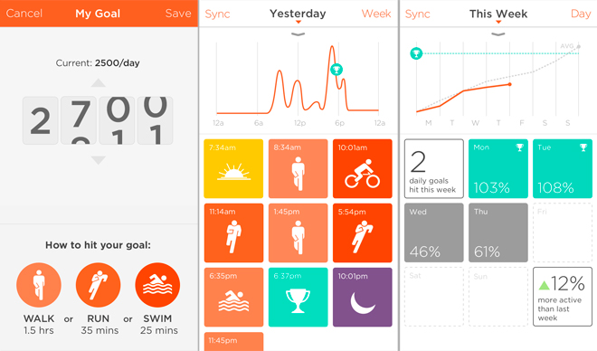
Jawbone provides two different views of your data. The first is activity, and the second is sleep. The numbers which are pulled out are useful chunks of information, though hardly actionable, and the graphs along the top are little more than decorative.

Fitbit

Fitbit

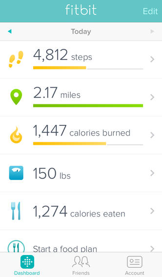
Fitbit’s app provides one of the most pared down dashboards, featuring only a select list of data. There are additional graphics available on their website, but the app remains limited. Being provided with mostly numbers is not exactly motivating.

Withings Health Mate

Withings

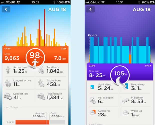
The Health Mate application has multiple panes the user can swipe through, and it provides multiple graphs one each of these panes which the user can scroll through. While the graphs are effective, there are quite a few to take in.

Moves App

Moves
While not designed for a device external to the phone, the Moves app does make use of current smartphones capabilities to track your movement. Unlike the others featured here, it does not present or even try to capture sleep data, but it offers a combination of movement and location tracking in a simple linear path.


Realtime: Color Microtrends Proposal

Subject: A tool for designers to identify micro-trends in colors.

Data: I found out ColourLovers has a pretty clean API.
http://www.colourlovers.com/api

Design Comp:
Alpha Version

Subject: A web component for the Advance App, a personal data tracking and reccomendation system developed to promote decisive and productive behavior with technology.

Data: The website will use different ability levels linked to a collection of personal data APIs, such as:
– MyFitnessPal
– Lumosity
– Khan Academy
– Samsara
– CodeAcademy

Design Comp: A reinterpretation of the UI from the app.

Research: Part I

Data Visualization Aggregator: https://www.tictrac.com
– Collects data from multiple personal APIs, and puts the data together into various graphs of your choosing.

Visualization: Feltron Annual Report: http://feltron.com/ar12_04.html
– Founder of Daytum and the Reporter app produces annual reports with his amassed data. The particular linked one provides a fascinating graph of being with friends versus the intimacy of the occasion.

Artist/Designer: http://theofficeof.feltron.com
– Nick Feltron of the above visualization does some neat work.

Visualization Tool: http://mikemcdearmon.com/portfolio/techposts/charting-libraries-using-d3
– Collection of extensions for the D3.js library.

Data Collection Tool: http://www.sitepoint.com/creating-a-graph-with-quartz-2d/
– Creating a graph with Quartz 2D for an iOS app, the particular link being an extensive tutorial.

Discussion Forum: http://www.reddit.com/r/visualization/
– Reddit, of course.

Criticism: http://www.fastcodesign.com/3020080/nikes-new-fuelband-se-highlights-its-ux-flaws
– Criticism of the Nike Fuelband app visualization.

Data Source: http://www.reddit.com/r/datasets/
– People sharing datasets for fun.

Data Ethics: http://www.technologyreview.com/news/514346/the-data-made-me-do-it/
– “The Data Made Me Do It” – Specifically looking at Google Now.

A Book: http://amzn.com/B00F0WRXI0
– “Data Smart,” Interesting mix of technicalities (graphic modularity, AI, regressions) and design theory (making it compelling)—a good all-round text on visualizing data.

Little Big Data: Top Reddit Posts

  • Top 2.5 Million Posts on RedditThe concept of Reddit as the frontpage of the internet is intriguing–and generally produces images of memes or cats. But where do the interests actually tend to, and can it provide any useful insight?
  • Chris Dary’s DatasetBroken down into separate CSV files by subreddit:
    https://github.com/umbrae/reddit-top-2.5-million
  • Gephi, maybe ProcessingI’ve got some experience with Processing, so it would be a shame to not put it to use. But I’d like to play with the data in Gephi first and see if I’ll need more capability or not. I’d also like to take a stab at R—but maybe now is not the time?

Some other datasets:
– Huge movie database, 2,300+ movies (https://docs.google.com/file/d/0ByF5keQa-4J1ZkxCYlVPcTVxc2c/edit)
– Full transcription of public utterances/recordings by Mark Zuckerberg (http://zuckerbergfiles.org)

Redesign Assignment

Original

Original


Redesign

AirlineCost-474

Once I began playing with the graphic, I realized that a line graph suited the data quite well–I realized I would just have to kind of play with it. The first step I took was  altering the data to be more relatable (making it per 100 miles) and making it less skewed by starting the graph at 0 on the y-axis. Then I played with the use of graphics and added some additional info.