All posts by Jess

Little Big Data Assignment

All of the Olympic events and medals since 1924

Given that it’s kind of topical at the moment, though for shame it will no longer be by the time the project is finished, I’d like to map the data shown here, of all the Olympic events and medals awarded since 1924. Hopefully, at the close of the 2014 Sochi Olympics, I’ll be able to add that data to the set as well.

I imagine it’ll be mapped by country, with differing text sizes and colors to account for the number of medals earned and in what year and such. I’m not certain of how, exactly it will look.

Tools:
Excel (advanced), obviously the map the data.
I’d like to brush up on Processing (moderate) , and think the learning curve would be the least steep given all of the information provided in the textbook.
Then I’ll clean everything up in Illustrator (advanced) for final publication.
Data Visualization Redesign

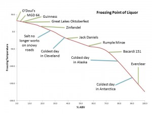
Freezing Point of Liquor


First off, it’s just incredibly boring and the title is incorrect. These aren’t all Liquors, some are beer and wine. It’s difficult to suss out the exact freezing points of all of these different alcoholic beverages. The format is a line graph, which doesn’t make any sense; rather it should be plotted as a line graph.

And the redesign below: 

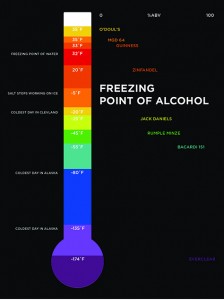
The Freezing Point of Alcohol

I gave the redesign a new outfit, colored it and gave the contextual elements (all those that appear on the left in white) their own space. It’s not plotted incorrectly as a line graph, but rather more of a scatter plot basis. y-axis is still temperature and x-axis is the % Alcohol by Volume of each beverage. The contextual clues are no longer sorted by %ABV like they were in the original visualization because these data points have no %ABV.

(The colors are all technicolor and weird and I’m not sure how to get the actual colors to show up…)

 Freezing Point of Liquor