The subject of your web page:
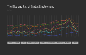
I’m interested in exploring global employment statistics and identifying employment trends through time. I’m going to present the data through a large line graph. The user will be able to click on a country of their choosing and that line in the graph will turn into an area graph and more detailed information about the selected country will appear below the menu of countries.
I’d like the user to then be able to click to see more detailed information on that specific country’s employment statistics, like unemployment numbers for men vs. women, unemployment numbers for different age groups, and the way the country’s economy is divided. It would be interesting to be able to compare one country’s unemployment numbers of women to another country’s.
The data you will use:
The data set is International Labor Comparisons from the Bureau of Labor Statistics from the United States Department of Labor. It is very detailed and shows employment data from 1970 to 2012 of the following countries: United States, Australia, Canada, France, Germany, Italy, Japan Korea, Mexico, Netherlands, New Zealand, South Africa, Spain, Sweden, Turkey and the United Kingdom.
The data set also includes employment statistics divided by different sectors of the economy (agriculture, industry, manufacturing, and services), as well as unemployment statistics divided by age group and gender. The excel file is very clear and easy to understand.
The technologies you will use:
I felt like I was getting more comfortable with javascript, but I worry about the timeline with this project. So, I think I will use processing for this project. I felt more comfortable with processing and think I could probably do more with animations and other transitions.
Identify and plan for every challenge.
Some of the data in the data set is not complete for some of the countries. However, I think I can get around that by either excluding those countries, or excluding earlier dates. Since Turkey, South Africa, and Mexico have limited data that was collected, I will likely exclude them from the visualization.
Challenges that I foresee:
- I believe that the most challenging part of this project will be the coding.
- I’m concerned about getting the graphs to look exactly as I’d like
- Creating nice-looking transitions between different date views…
- Having different views show up on hover and animated
- Dealing with such a large data set…
- Making sure that all of the functionality I want works, while still looking great.
- Perhaps toning down the amount of information that the viewer sees…
Design Comp: