All posts by Jayne Lee
Interaction Assignment Proposal
Interaction Assignment Proposal (Revised)
jayne-proposal
Little Big Data Assignment
Realtime Assignment Proposal
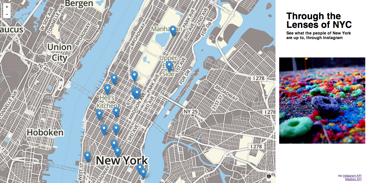
Subject:
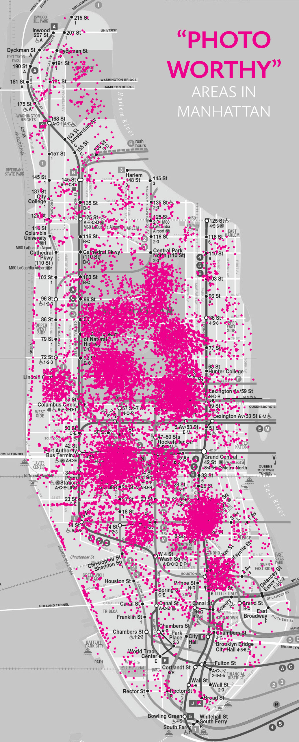
I really wanted to use locational data from Instagram because I find it interesting to see where everyone’s photos are being taken, especially when they are extremely detailed shots. It gives a reference and helps to shape the picture in your mind of the story behind the photo. The purpose of my realtime data visualization is to show the most popular areas in the city (Manhattan only) to take photos, or is “photo-worthy”. This may influence people to go specifically to these places out of curiosity and perhaps allow more people to explore different parts of the city that they had never seen or experienced before.
Data:
Instagram API
–locations
-geographies
Design Comp:
Little Big Data Assignment Proposal
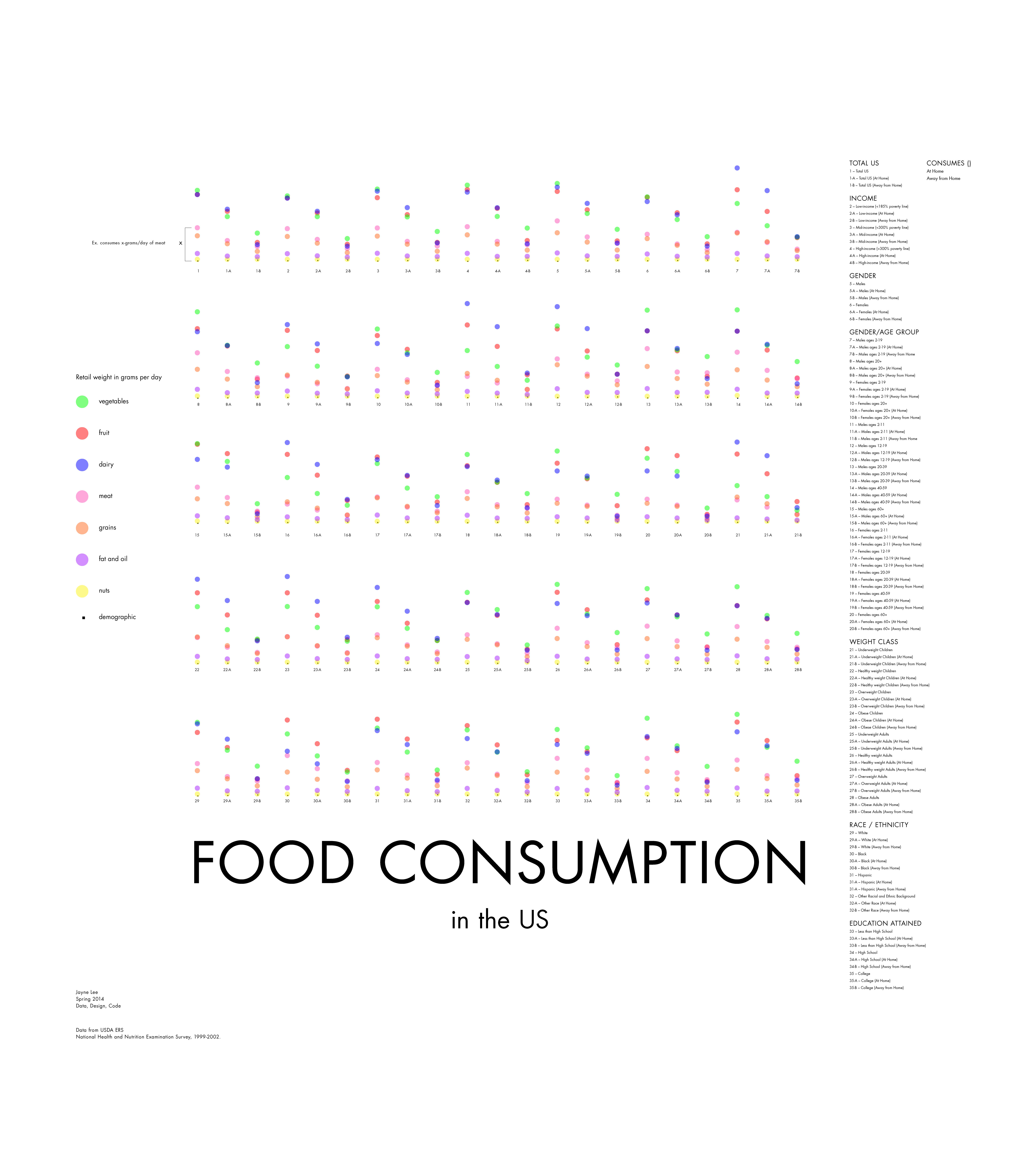
Subject:
I’m really interested in food studies/controversies and I want to create a data visualization regarding all the research that has already been done, perhaps in an effort to persuade the viewer to think about their eating habits. My goal isn’t to shove a specific belief down one’s throat, but mainly to stimulate a discussion.
Specifically, I want to create a visualization regarding the food consumed by Americans — broken down into different categories, from very detailed to very broad. Potentially I can also include data that may be influenced by different types of consumption (ex. food availability).
Data:
USDA ERS data
Tools:
Processing – intermediate
Illustrator
Excel
*If I get the chance to, I would really like to incorporate APIs
Redesign Assignment
Tweets about #Sochi2014, Day 4 (original visualization)
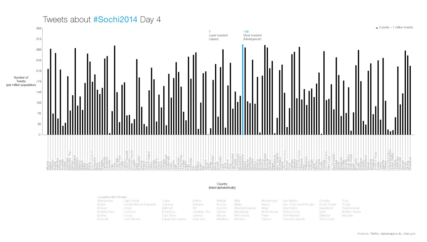
sochi-tweets-4 (redesign)
According to the title, the original visualization’s main focus should’ve been the number of tweets for every country, but the focus seemed to have shifted over to the geographic location of each country. The color coding with the scale is also confusing because logically a higher contrasting color would mean more of something, and vice versa.
I decided to accomplish the main goal, which is to show the number of tweets that were tweeted regarding the #Sochi Olympics on Day 4 from each country. To be as objective as possible, I listed the countries alphabetically. I also avoided using too many colors to put emphasis on the focus of the number of tweets. However, since the visualization is difficult to read at a distance, I pointed out the most interesting data: the min and max values.
I decided to also add the countries that were not part of the data set, for good measure.
I tried to make this visualization interactive, but struggled a lot with Processing. But, when I figure out how to create this in Processing, I would like the user to be able to roll over each bar to display the country name and value. I also wanted to color code the countries by continents, to bring back the sub-focus of geographic location.
Survey Visualization
Research Assignment Part 1
Data Visualization Aggregator:

I got to witness np-food.com presented and created by an NYU student at an event hosted by tech@nyu. It’s a product created that gives you different combinations of what you can order at a restaurant by inputting a specific amount of $ you’re willing to spend.
A Visualization:
Food & Flavors
Artist/Designer:
Jer Thorp is a digital artist and designer. He currently works for the NY Times creating data visualizations. (His TED talk is referenced below)
Visualization Tool:
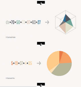
FF Chartwell is a font that isn’t a typeface. It was created by Travis Kochel. I found this to be really awesome and ingenious. Obviously not meant for typical data visualizations, but interesting concept.
D3.js is a javascript library that allows you to create visualizations. I’ve personally never used it before, but I definitely would like to try and create one, once I’ve learned some more js.
Data Collection Tool:
Excel
Daytum is a tracking app. You can track anything, all you have to do is specify and run it.
Discussion Forum:
Jer Thorp: The Weight of Data
This is a TED talk where the data designer Jer Thorp (as mentioned above) explains how data is easier to digest once it is humanized. On the same note, it can also thus, be very powerful.
Criticism:
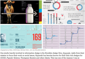
This is an article/interview about “the good and evil of infographics”. It’s written and the interviewee are both from the same information design firm in Brooklyn called Hyperakt. (This also overlaps into the Data Ethics source).
Data Source:
timeanddate.com is a site that has the time and date in regards to the weather, time zone, moon phases, etc. I really like astronomy and staring at the sky, so this is an informative site if you wanted to plan to watch an eclipse or something related.
Data Ethics:
Again this is the same article/interview as “The good and evil of infographics”, but the interviewee mentions a crucial point about data ethics. This reminded me of James Corner’s piece called “The Agency of Mapping”. To quickly summarize, Corner argues that when creating a map/diagram (data visualization) it always becomes subjective.
A Book:
Information visualization: design for interaction
by Robert Spence
Fully revised textbook on the rapidly growing field of Information Visualization. Its emphasis is on real-world examples and applications of computer-generated and interactive visualization. Information visualization deals with representing concepts and data in a meaningful way. Depending on the medium used, information can be visualized in either static (e.g. a graph on a printed page) or dynamic forms. This book is appropriate for courses in information visualization, human-computer interaction, interaction design, and computer graphics. (from pearson.ch)