Data Visualization Aggregator:

I got to witness np-food.com presented and created by an NYU student at an event hosted by tech@nyu. It’s a product created that gives you different combinations of what you can order at a restaurant by inputting a specific amount of $ you’re willing to spend.
A Visualization:
Food & Flavors
Artist/Designer:
Jer Thorp is a digital artist and designer. He currently works for the NY Times creating data visualizations. (His TED talk is referenced below)
Visualization Tool:
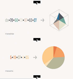
FF Chartwell is a font that isn’t a typeface. It was created by Travis Kochel. I found this to be really awesome and ingenious. Obviously not meant for typical data visualizations, but interesting concept.
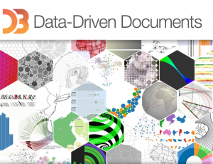
D3.js is a javascript library that allows you to create visualizations. I’ve personally never used it before, but I definitely would like to try and create one, once I’ve learned some more js.
Data Collection Tool:
Excel
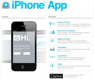
Daytum is a tracking app. You can track anything, all you have to do is specify and run it.
Discussion Forum:
Jer Thorp: The Weight of Data
This is a TED talk where the data designer Jer Thorp (as mentioned above) explains how data is easier to digest once it is humanized. On the same note, it can also thus, be very powerful.
Criticism:
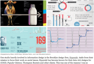
This is an article/interview about “the good and evil of infographics”. It’s written and the interviewee are both from the same information design firm in Brooklyn called Hyperakt. (This also overlaps into the Data Ethics source).
Data Source:
timeanddate.com is a site that has the time and date in regards to the weather, time zone, moon phases, etc. I really like astronomy and staring at the sky, so this is an informative site if you wanted to plan to watch an eclipse or something related.
Data Ethics:
Again this is the same article/interview as “The good and evil of infographics”, but the interviewee mentions a crucial point about data ethics. This reminded me of James Corner’s piece called “The Agency of Mapping”. To quickly summarize, Corner argues that when creating a map/diagram (data visualization) it always becomes subjective.
A Book:
Information visualization: design for interaction
by Robert Spence
Fully revised textbook on the rapidly growing field of Information Visualization. Its emphasis is on real-world examples and applications of computer-generated and interactive visualization. Information visualization deals with representing concepts and data in a meaningful way. Depending on the medium used, information can be visualized in either static (e.g. a graph on a printed page) or dynamic forms. This book is appropriate for courses in information visualization, human-computer interaction, interaction design, and computer graphics. (from pearson.ch)