Link to previously existing data visualization:
Chicks Rule? (Information is beautiful)
Redesign of the above data visualization:
Preview:
PDF Document:
Vanshika_Swaika_Week2_Data Redesign
Write Up:
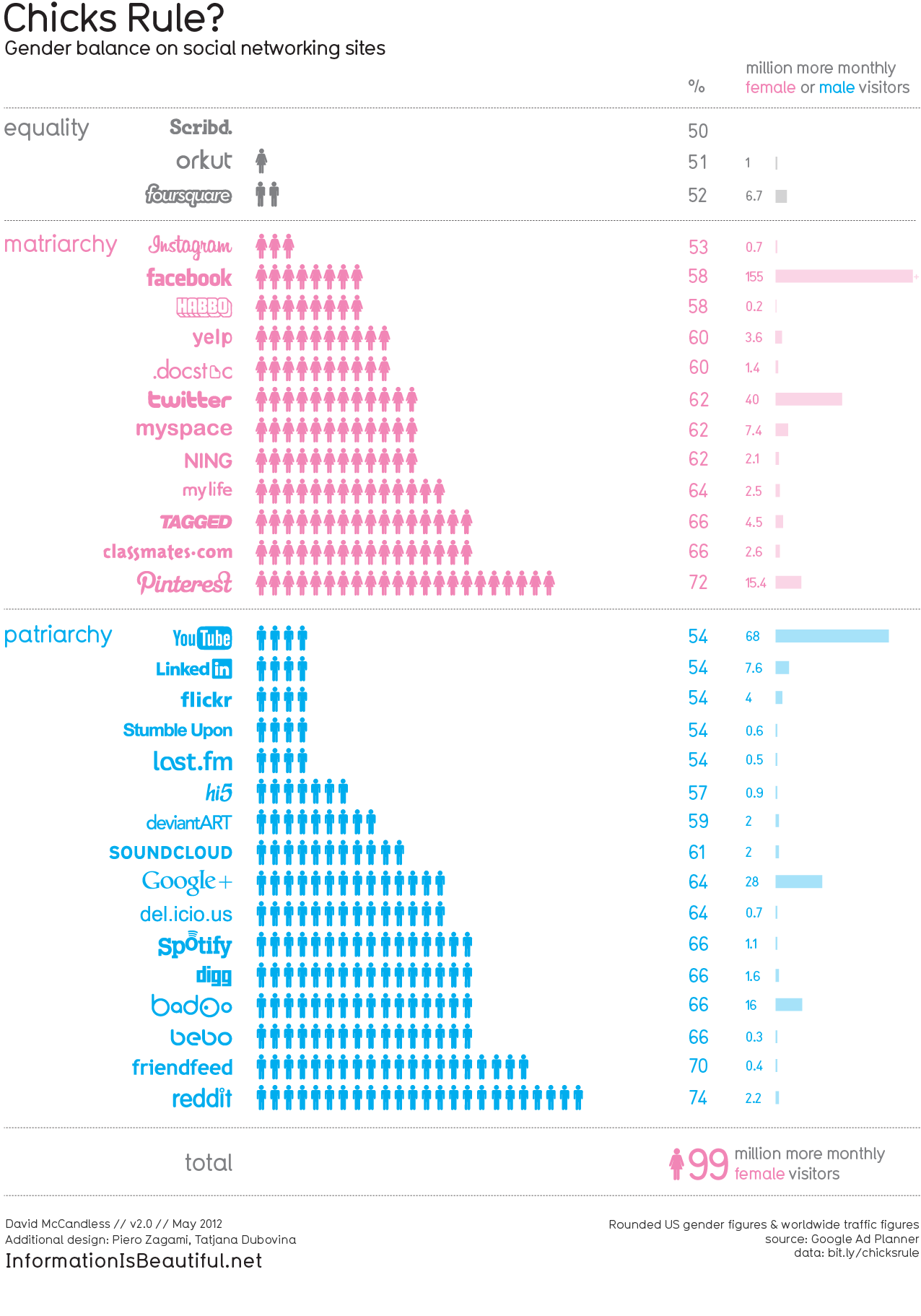
The data visualization I chose gives information about gender based use of social networking sites. The design makes it clear at first glance that it is gender associated but I was confused by the number of stick figures for each gender along with the bar that associated the million more users. Also, after reading the data source I realized that the visualization displays false data. Overall I felt that if this visualization illuminated some more data on specific social networks instead of just gender based use on so many networks, it would be more effective.
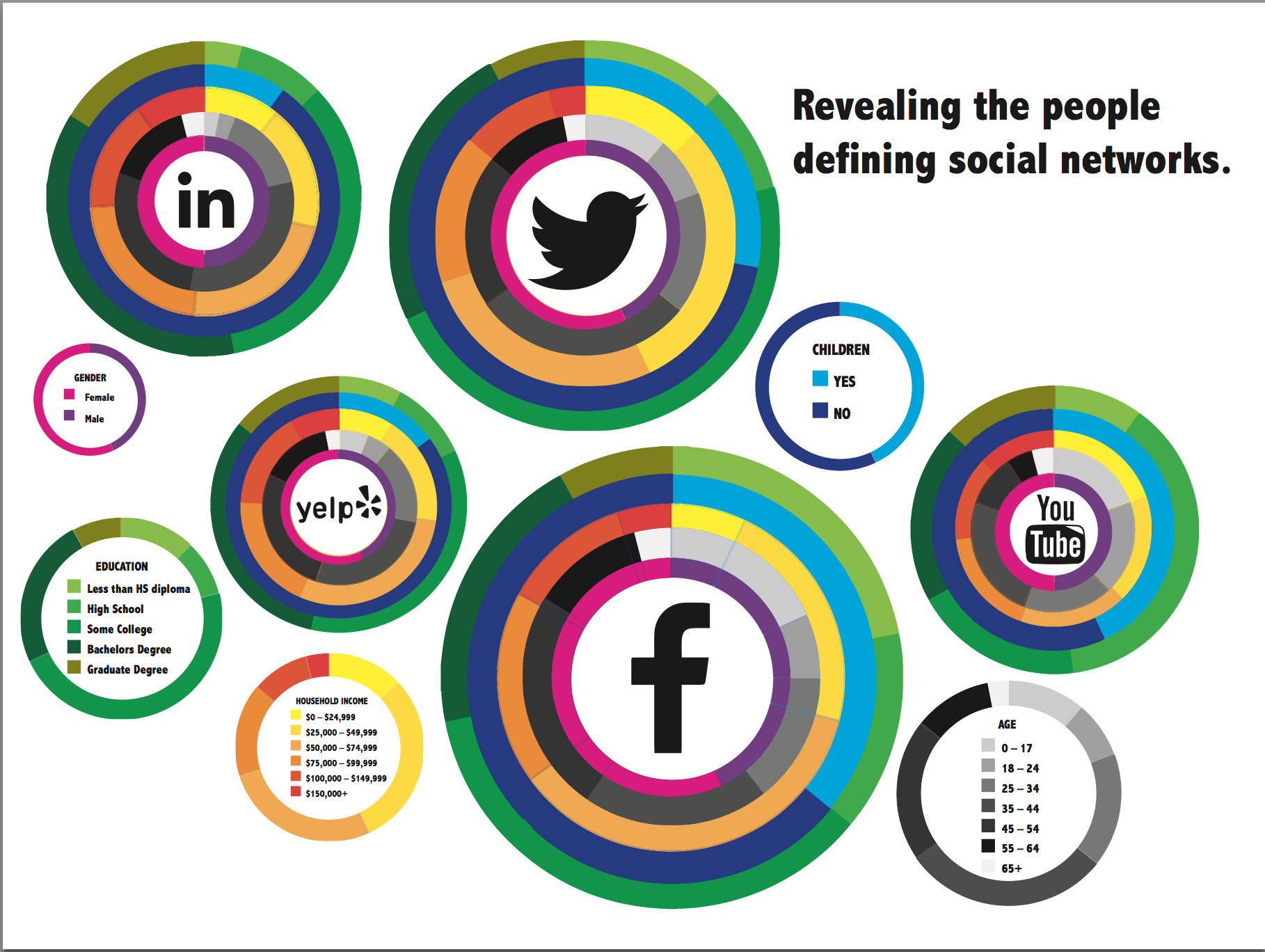
Hence, for my redesign I chose the most popular social networks out of the data provided, and decided to display more data about those specific networks. My aim behind my design was to not only display meaningful data but also make it visually compelling.