Original
Redesign

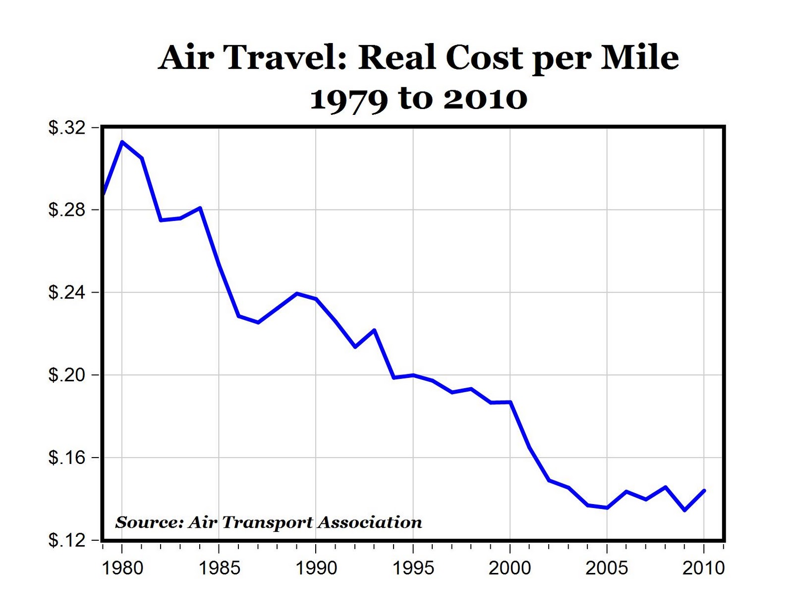
Once I began playing with the graphic, I realized that a line graph suited the data quite well–I realized I would just have to kind of play with it. The first step I took was altering the data to be more relatable (making it per 100 miles) and making it less skewed by starting the graph at 0 on the y-axis. Then I played with the use of graphics and added some additional info.