Tweets about #Sochi2014, Day 4 (original visualization)
sochi-tweets-4 (redesign)
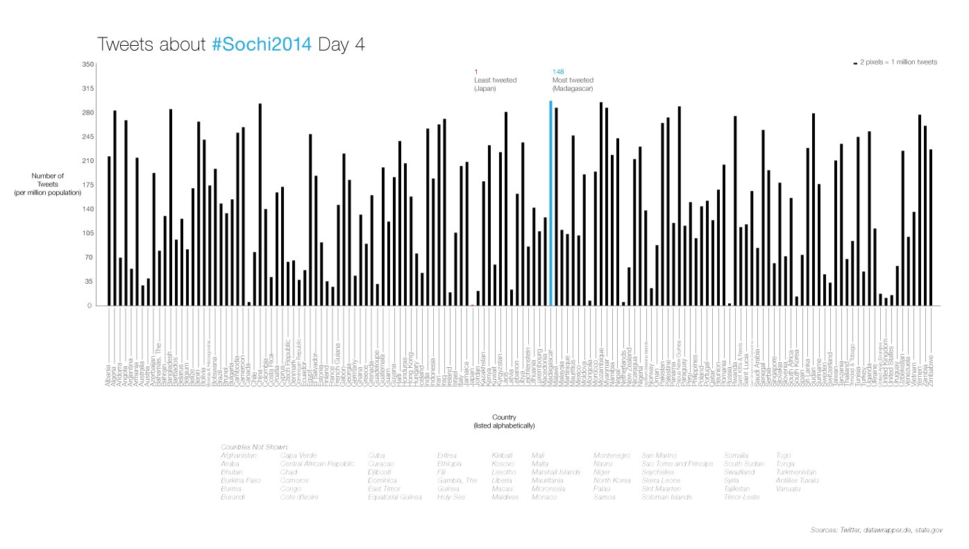
According to the title, the original visualization’s main focus should’ve been the number of tweets for every country, but the focus seemed to have shifted over to the geographic location of each country. The color coding with the scale is also confusing because logically a higher contrasting color would mean more of something, and vice versa.
I decided to accomplish the main goal, which is to show the number of tweets that were tweeted regarding the #Sochi Olympics on Day 4 from each country. To be as objective as possible, I listed the countries alphabetically. I also avoided using too many colors to put emphasis on the focus of the number of tweets. However, since the visualization is difficult to read at a distance, I pointed out the most interesting data: the min and max values.
I decided to also add the countries that were not part of the data set, for good measure.
I tried to make this visualization interactive, but struggled a lot with Processing. But, when I figure out how to create this in Processing, I would like the user to be able to roll over each bar to display the country name and value. I also wanted to color code the countries by continents, to bring back the sub-focus of geographic location.