What do you want to show? Why? What about your data is interesting?
I want to show UK foreign aid spending, suggesting that it should be cut (unless continued research changes my mind on the debate which I doubt).

On airplanes you’re told to “secure your own oxygen mask before assisting others”. At a time when everyone is harping on about the economy and how the budget deficit was at GBP 85.1 billion (fiscal year 2012-13), it seems nonsensical to be aiming to spend GBP 11.3 billion/year in foreign aid. It is likely a race to be the first of the G8 to meet the 0.7% of GDP target promulgated by the UN. Critics ask how much of that money is lost in translation or wasted…does foreign aid encourage sustainable development? Most statistics only tell us about the short-term fixes (vaccinations, school supplies etc.) Many are also unhappy that middle-income countries are receiving money through multilateral aid set up by the EU and UN agencies. Justine Greening, the international development secretary said:
“You only have to look at business generated by China and India to see the potential they provide for UK companies as their export markets continue to develop.”
Yet, after the launch of India’s first spacecraft to Mars through their $1 billion space program, their finance minister Pranab Mukherjee said that aid from the UK (280 million GBP/year) was:
“…a peanut in out total development expenditure.”
And the UK will continue to “aid” India till 2015. WHAT IS THE POINT? WHAT IS LIFE? Not to mention that the UK sells weapons to third world countries on the regular which hardly puts their focus on development. Oh the irony.

How will this translate into a data visualisation? What data are you using?
My main visualisation, built with code (Processing), will depict this dataset showing UK foreign aid spending from 1960-2009: https://docs.google.com/spreadsheet/ccc?key=0AonYZs4MzlZbdGY4VXR1RmRkY0dOUG9jejNEM0JNaEE&hl=en#gid=0
And this one from 2010-2015 (proposed): https://docs.google.com/spreadsheet/ccc?key=0AonYZs4MzlZbdHlLaVZaWjlsbHExVmpnbU41ZDJhYmc&hl=en#gid=0
I then intend to pick out interesting areas for smaller complementary visualisations/graphs:
- comparison with other nations’ spending budgets (e.g. the USA)
- percentage of aid that actually reaches its destination country
- what aid money is used for in its destination country
- suggestions of what the same amount of money could provide for within the UK
I am using data collected by The Guardian (UK) newspaper to show that their schmaltzy disposition can’t override the common sense that data screams. Their articles come with downloadable data sets. Some articles already feature simple graphs/data visualisations which will aid my understanding.
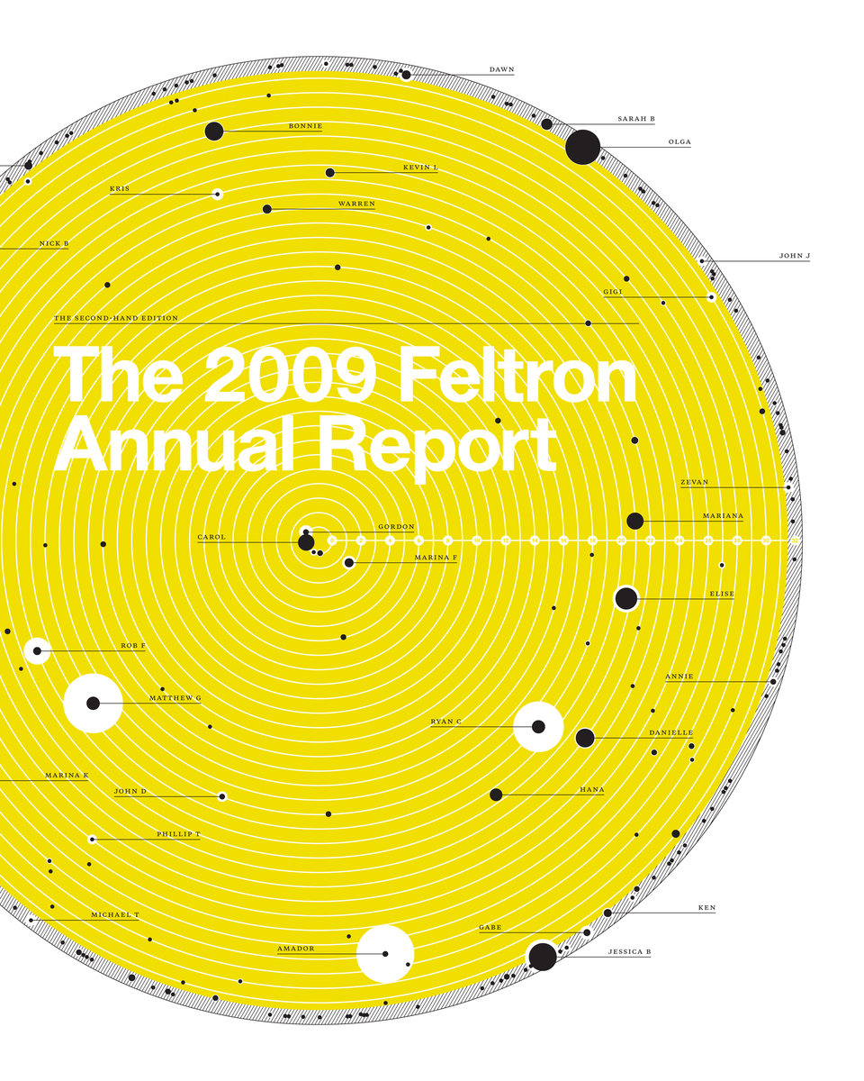
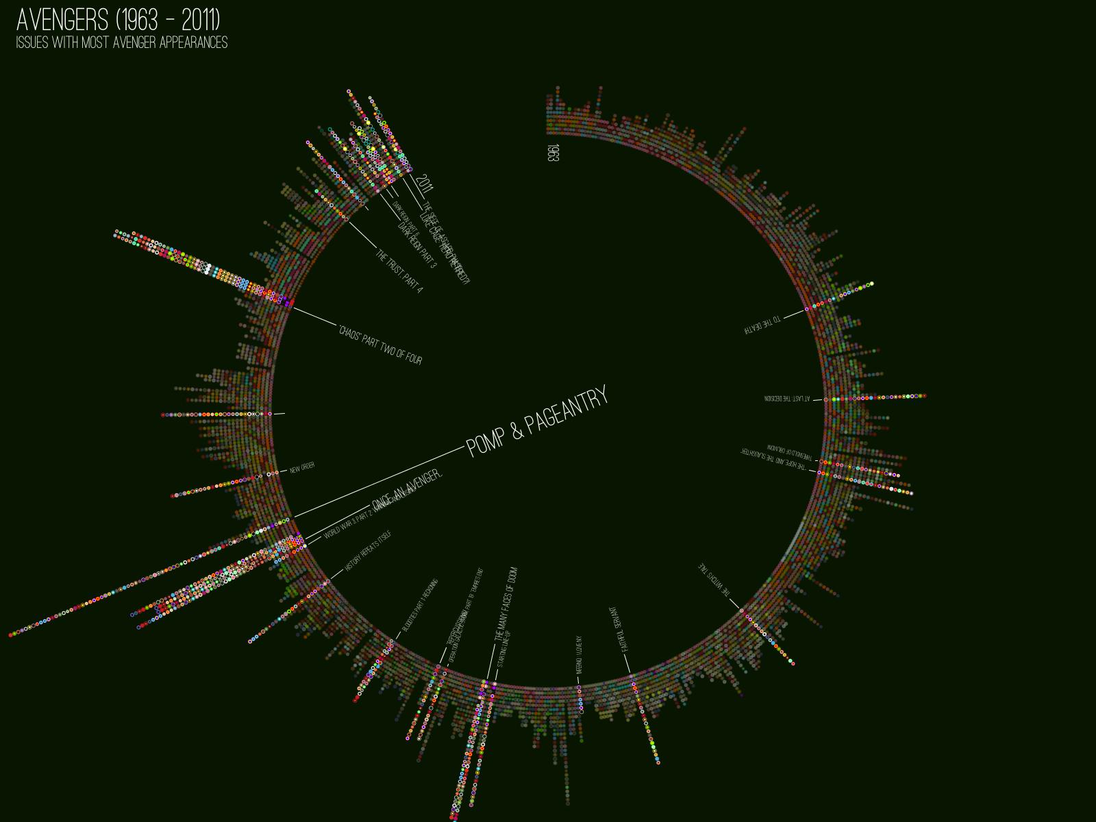
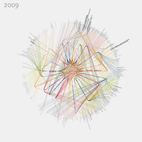
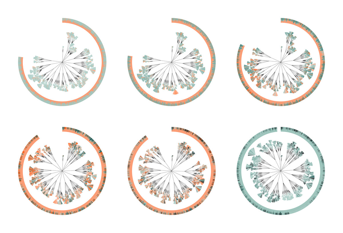
Visual inspiration
I imagine the main visualisation to be circular and complex, with the accompanying smaller graphs to be varied and sprouting off the main frame like weird growths. I kind of want it to look ludicrous to reflect the information.