UK foreign aid, 1962-present
There are over 200 countries over a span of more than 50 years, accounted for in this data visualisation.
Each country that currently receives aid from the UK is depicted by a red bar and its half overlapping pink bar. Each country that has received UK aid in the past is represented by a green bar. The longer the bar, the more aid received in a single year, and for each country some 50 translucent bars are layered over each other to give a condensed depiction of aid received by that nation since 1962. The pink bar, however, represents the amount of aid received in 2014 alone.
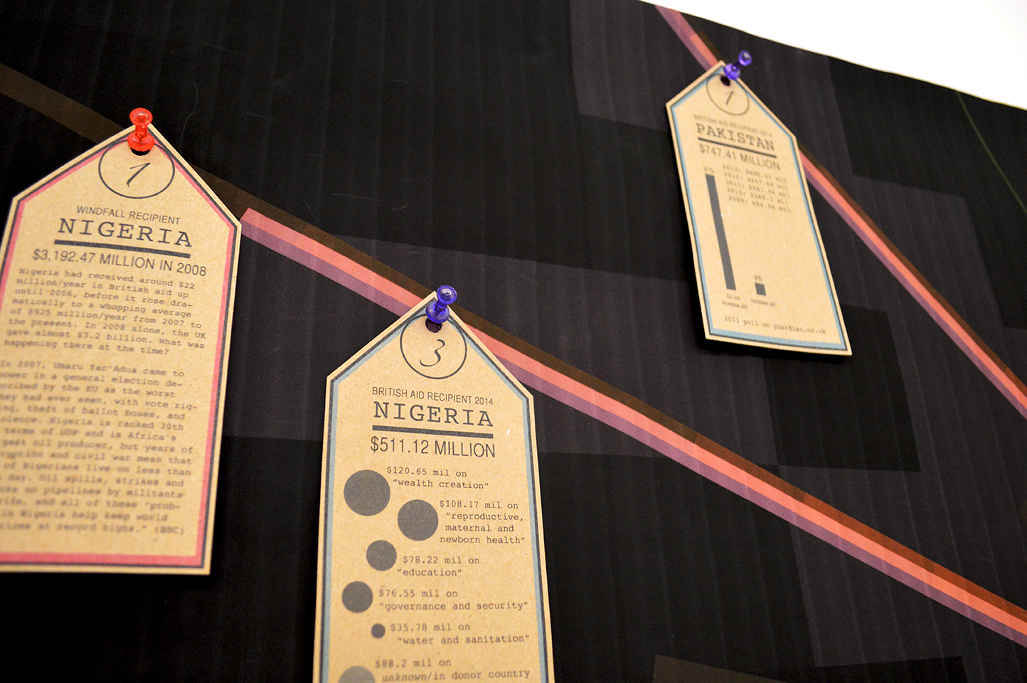
To slightly relieve the viewer from the abstraction of the central visualisation, the tags highlight the most significant data, aided by simple infographics, background information and/or points of contention :
- the top 3 recipients of aid in 2014
- the top 4 recipients of aid cumulatively since 1962
- the 2 largest amounts of aid received by one country in a single year