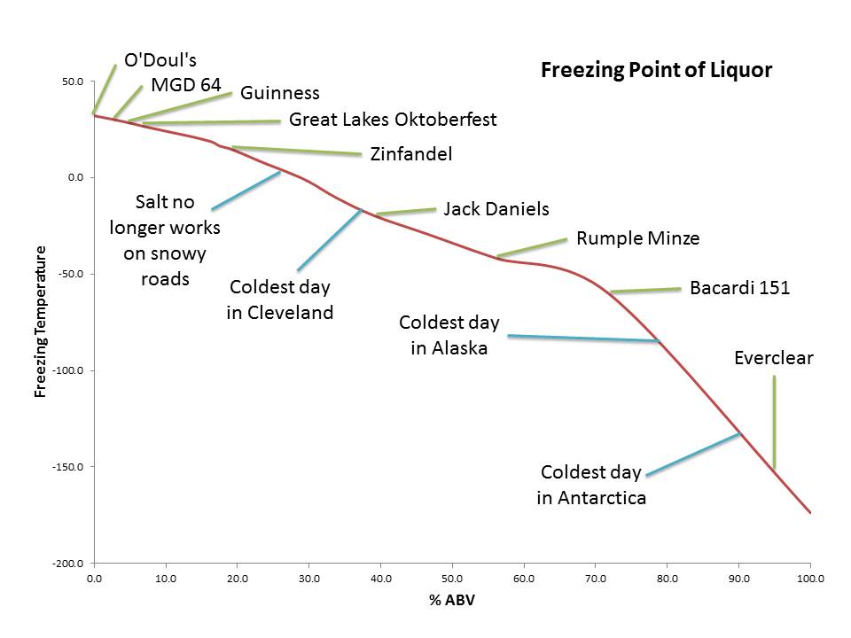
First off, it’s just incredibly boring and the title is incorrect. These aren’t all Liquors, some are beer and wine. It’s difficult to suss out the exact freezing points of all of these different alcoholic beverages. The format is a line graph, which doesn’t make any sense; rather it should be plotted as a line graph.
And the redesign below:
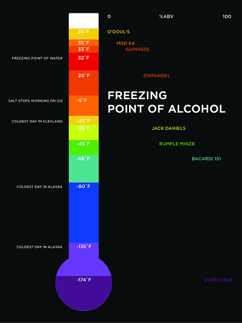
I gave the redesign a new outfit, colored it and gave the contextual elements (all those that appear on the left in white) their own space. It’s not plotted incorrectly as a line graph, but rather more of a scatter plot basis. y-axis is still temperature and x-axis is the % Alcohol by Volume of each beverage. The contextual clues are no longer sorted by %ABV like they were in the original visualization because these data points have no %ABV.
(The colors are all technicolor and weird and I’m not sure how to get the actual colors to show up…)