Category Archives: Uncategorized
Week 2_Redesign Assignment
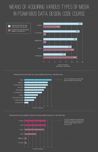
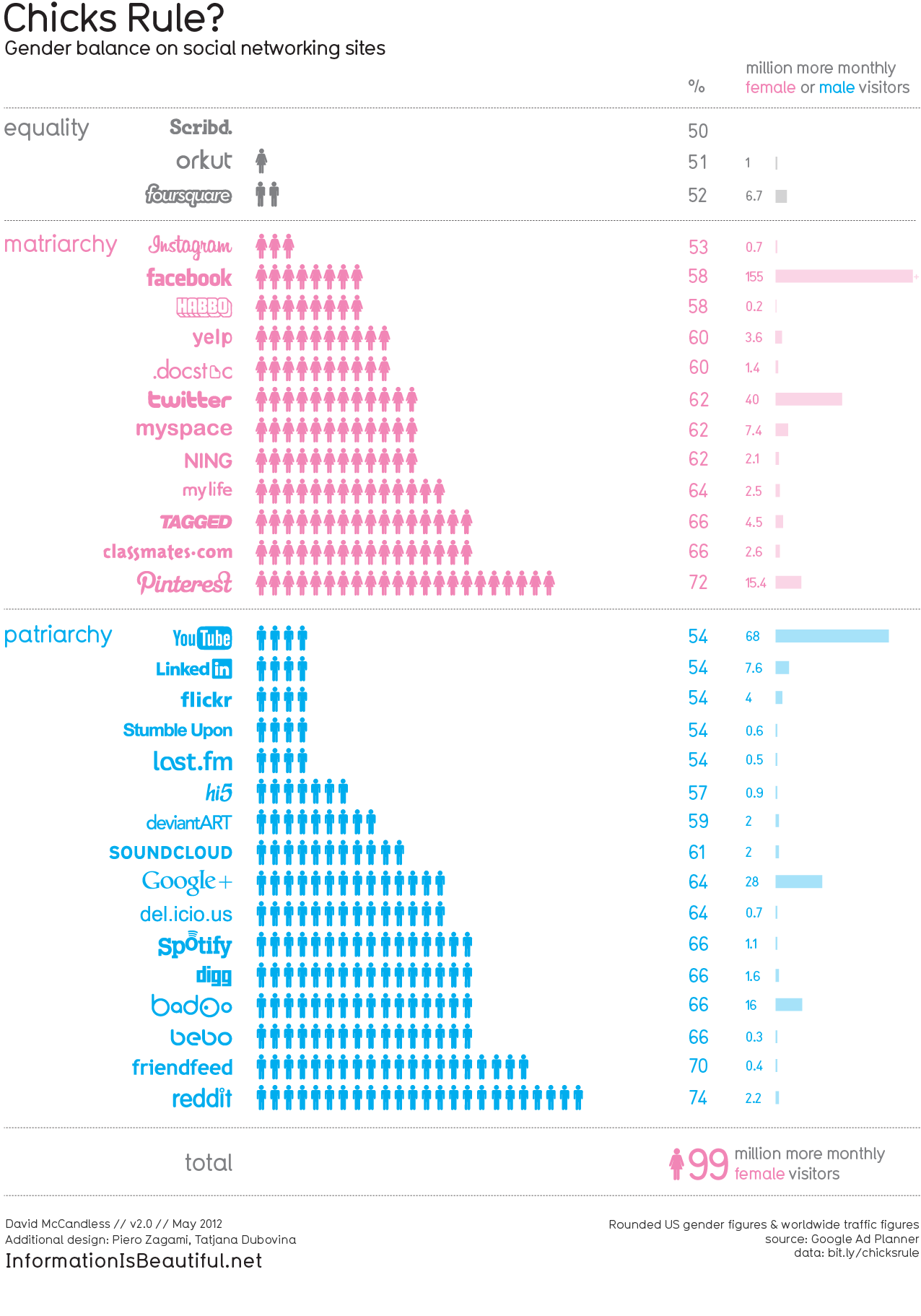
Link to previously existing data visualization:
Chicks Rule? (Information is beautiful)
Redesign of the above data visualization:
Preview:
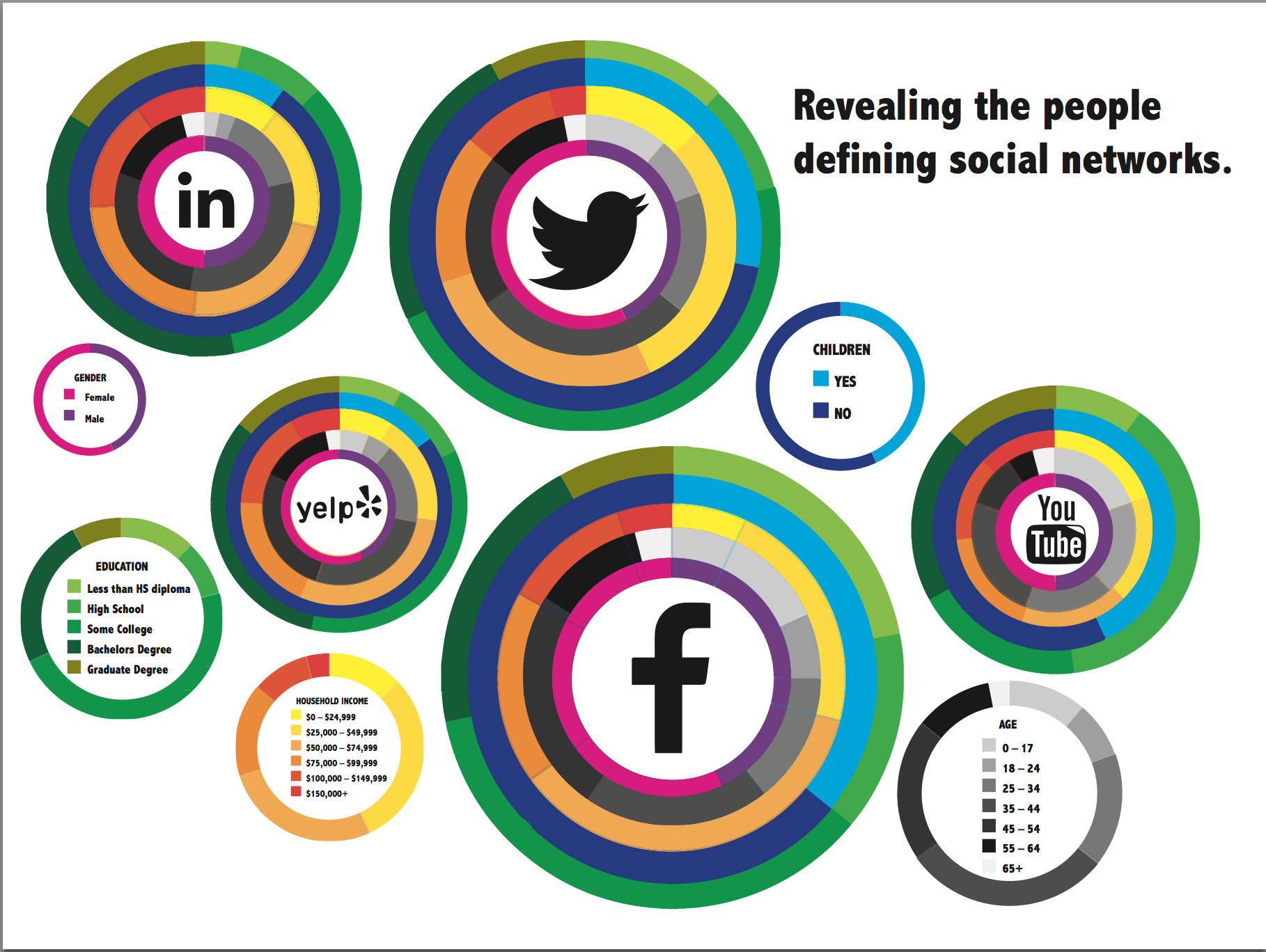
PDF Document:
Vanshika_Swaika_Week2_Data Redesign
Write Up:
The data visualization I chose gives information about gender based use of social networking sites. The design makes it clear at first glance that it is gender associated but I was confused by the number of stick figures for each gender along with the bar that associated the million more users. Also, after reading the data source I realized that the visualization displays false data. Overall I felt that if this visualization illuminated some more data on specific social networks instead of just gender based use on so many networks, it would be more effective.
Hence, for my redesign I chose the most popular social networks out of the data provided, and decided to display more data about those specific networks. My aim behind my design was to not only display meaningful data but also make it visually compelling.
Week 1_Survey Assignment
Survey Visualization
Week 1 – Survey Assignment
Survey Assignment

Research Assignment Part 1
Data Visualization Aggregator
http://www.visualcomplexity.com/vc/
“The project’s main goal is to leverage a critical understanding of different visualization methods, across a series of disciplines, as diverse as biology, social networks or the World Wide Web.” A site with many neat data visualizations.
A Visualization
http://www.upworthy.com/heres-a-fact-about-sharks-and-humans-thatll-stay-with-you-every-hour-on-the-hour-today
Sharks don’t kill people; people kill sharks. () Upworthy’s not usually my favourite, but I came across this on the Facebook page of a shark loving friend, and unsustainable fishing is bad. Also, this one on other fish we eat but shouldn’t. http://infobeautiful3.s3.amazonaws.com/2013/01/1276_Which_Fish_2013.png
Artist/Designer
http://alignedleft.com/
Scott Murray. A self declared “code artist,” specializing in data visualization, generative art and designed experiences with the goal of getting people to slow and down and take a closer look at things.
Visualization Tool
https://github.com/jagracar/grafica
The grafica library for Processing. Helps create 2D plots/graphs. Includes features that allow you to zoom/pan around your visualization (“make your data move!”), and add/display labels with ease.
Data Collection Tool
http://vis.stanford.edu/wrangler/
Wrangler, from Stanford U. Puts your un-charted data into tables for you, but you’ll probably learn more if you do do it yourself..
Or really anything else from this lovely list by ComputerWorld: http://www.computerworld.com/s/article/9215504/22_free_tools_for_data_visualization_and_analysis
Discussion Forum
http://www.reddit.com/r/visualization/
Reddit’s r/visualization. Discussions on coding visualizations, mostly. Additionally r/dataisbeautiful has more examples and is generally prettier, but r/visualization is more helpful. r/learnprogramming could be handy as well.
Criticism
http://www.theguardian.com/news/datablog/2013/jul/24/why-you-should-never-trust-a-data-visualisation
An article that speaks against trusting data visualization at all, claiming it’s biased to the creator. The author claims that things like this http://www.washingtonpost.com/blogs/worldviews/wp/2013/05/15/a-fascinating-map-of-the-worlds-most-and-least-racially-tolerant-countries/ are widely accepted as objective fact, and how that’s a problem. Pretty much a less funny version of the house hippo argument (http://www.youtube.com/watch?v=NBfi8OEz0rA).
Data Source
http://www.cdc.gov/nchs/surveys.htm
Center for Disease Control and Prevention. Has many surveys/data sets related to health and diseases. Not the clearest site and/or data sets, but there’s a bunch of stuff on here if the topics interest.
https://explore.data.gov/ethics/
Or the US Govenrment data site. Search anything. I searched “POTUS” and got a list of White House visitor records. Select viewtype>datasets.
Data Ethics
http://www.technologyreview.com/news/424104/what-big-data-needs-a-code-of-ethical-practices/
What Big Data Needs: A Code of Ethical Practices. The author writes about how everything can be/is tracked in our lives both on and offline. And this was two years before the whole Snowden thing.
A Book
http://http://www.amazon.com/Best-American-Infographics-2013/dp/0547973373/
Best American Infographics 2013. Technically infographics, clearly, but some of them fall into the data vis category. Can be found at The Strand for $17.95 (or Amazon $6 less plus all the fun carbon emissions, etc. from shipping it directly to your door). Some very pretty visualizations on a variety of topics.
Research Assignment (Part 1)
- Data Visualization Aggregator
Datavisualization.ch is the news and knowledge resource for data visualization and infographics. Their mission is to provide us with the latest research findings and most topical use cases in this field – including cognitions from self initiated studies as well as a review of outstanding projects done by smart people in the community. It is also a perfect place to share your opinion and discuss interesting movements, to get inspired and ignite new ideas.http://datavisualization.ch
- A visualization
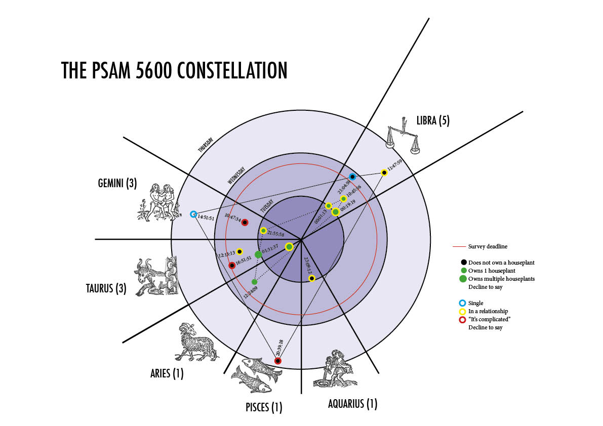
PhD student Joshua Katz mapped vernacular across America, such as words used to address a group of people, and followed up with a dialect quiz that gave you a probability that someone in an area of the United States would understand your local tongue.
http://spark.rstudio.com/jkatz/SurveyMaps/
- Artist/Designer
http://stamen.com/datavisualizationStamen is a design and technology studio in San Fransisco that builds maps and data visualizations.
- Visualization Tool
visual.lyVisually’s mission is to help create visual content that rises above the noise. Their platform seamlessly connects designers, journalists, animators and developers with clients, featuring cloud-based collaboration tools that allow them to deliver high-quality content at unprecedented scale and speed.
- Data Collection Tool
NumbersNumbers has everything you need to organize data, perform calculations, and manage lists. And you can do it all with just a few taps on any apple device.
- Discussion Forum
http://gizmodo.com/the-best-data-visualizations-of-2013-1485611407A discussion of the best data visualizations of 2013.
- Criticism
http://www.informationisbeautiful.net/blog/A blog that discusses info graphics and data visualizations.
- Data Source:
http://www.infochimps.comInfoChimps is an organisation that has developed a data supermarket. The platform hosts over 15.000 datasets from 200 different organisations and companies. Visitors can use these datasets to combine them with their own datasets for additional insights.
- Data Ethics
Data Mining: Where Legality and Ethics Rarely Meet
http://www.ecommercetimes.com/story/52616.htmlNews of data breaches and mortgage applicants being categorized as “risky” when inaccurate credit info and commercial demographic profiles are merged has finally made consumers aware of data mining.
- A Book
Harris and co-author Sep Kamvar released We Feel Fine: An Almanac of Human Emotion, a remarkable book exploring the 12 million human emotions recorded since 2005 through brilliantly curated words and images that make this massive repository of found sentiment incredibly personal yet incredibly relatable. From despair to exhilaration, from the public to the intimate, it captures the passions and dreams of which human existence is woven through candid vignettes, intelligent infographics and scientific observations.
Research Assignment
- Data Visualization Aggregator
http://visual.ly
Visual.ly is a great website solely dedicated to data visualizations. Users can upload, share and get inspired by its vast library of visualizations.
- A visualization
http://www.partselect.com/JustForFun/Appliance-Repair-Replace-Infographic.html
This particular info graph is one of my favorites. It is an interactive one with a very simple and beautiful layout . It allows the user to hover over each appliance and compare replacement and repairing costs.
- Artist/Designer
http://www.columnfivemedia.com
Column Five Media is a company that has offices in New York and California. They do a variety of visualization works including motion graphics and interactive info graphs.
- Visualization Tool
https://gephi.org
Gephi is an open source visualizing software that can be used for various purposes. Gephi is however best for dynamic network analysis. I have myself used it to visualize my Facebook social network.
- Data Collection Tool
http://nomi.com
Nomi is a New York based startup that allows it’s clients to collect data of their customers in order to gain valuable insight. One of their clients are Baked by Melissa.
- Discussion Forum http://www.visualizing.org
A website that allows creative participants to collaborate and design data visualizations.
- Data Source http://www.flightradar24.com/data/
A real time data website that gives information on flights and airports.
- Data Ethics http://blogs.hbr.org/2014/01/big-datas-dangerous-new-era-of-discrimination/
This particular blog post on Harvard Business Review has some very interesting points and discussions.
- A Book
http://www.informationisbeautiful.net/books/
Information is beautiful is one of my favorite websites and book. I have read the UK version though.
Research Assignment Part 1
Data Visualization Aggregator:

I got to witness np-food.com presented and created by an NYU student at an event hosted by tech@nyu. It’s a product created that gives you different combinations of what you can order at a restaurant by inputting a specific amount of $ you’re willing to spend.
A Visualization:
Food & Flavors
Artist/Designer:
Jer Thorp is a digital artist and designer. He currently works for the NY Times creating data visualizations. (His TED talk is referenced below)
Visualization Tool:
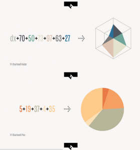
FF Chartwell is a font that isn’t a typeface. It was created by Travis Kochel. I found this to be really awesome and ingenious. Obviously not meant for typical data visualizations, but interesting concept.
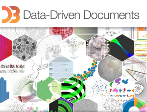
D3.js is a javascript library that allows you to create visualizations. I’ve personally never used it before, but I definitely would like to try and create one, once I’ve learned some more js.
Data Collection Tool:
Excel
Daytum is a tracking app. You can track anything, all you have to do is specify and run it.
Discussion Forum:
Jer Thorp: The Weight of Data
This is a TED talk where the data designer Jer Thorp (as mentioned above) explains how data is easier to digest once it is humanized. On the same note, it can also thus, be very powerful.
Criticism:
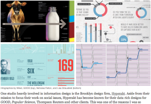
This is an article/interview about “the good and evil of infographics”. It’s written and the interviewee are both from the same information design firm in Brooklyn called Hyperakt. (This also overlaps into the Data Ethics source).
Data Source:
timeanddate.com is a site that has the time and date in regards to the weather, time zone, moon phases, etc. I really like astronomy and staring at the sky, so this is an informative site if you wanted to plan to watch an eclipse or something related.
Data Ethics:
Again this is the same article/interview as “The good and evil of infographics”, but the interviewee mentions a crucial point about data ethics. This reminded me of James Corner’s piece called “The Agency of Mapping”. To quickly summarize, Corner argues that when creating a map/diagram (data visualization) it always becomes subjective.
A Book:
Information visualization: design for interaction
by Robert Spence
Fully revised textbook on the rapidly growing field of Information Visualization. Its emphasis is on real-world examples and applications of computer-generated and interactive visualization. Information visualization deals with representing concepts and data in a meaningful way. Depending on the medium used, information can be visualized in either static (e.g. a graph on a printed page) or dynamic forms. This book is appropriate for courses in information visualization, human-computer interaction, interaction design, and computer graphics. (from pearson.ch)
Research Assignment
Data Visualization Aggregator – Information Aesthetics
Information Aesthetics is a collection of beautiful and interesting visualizations and discusses each one.
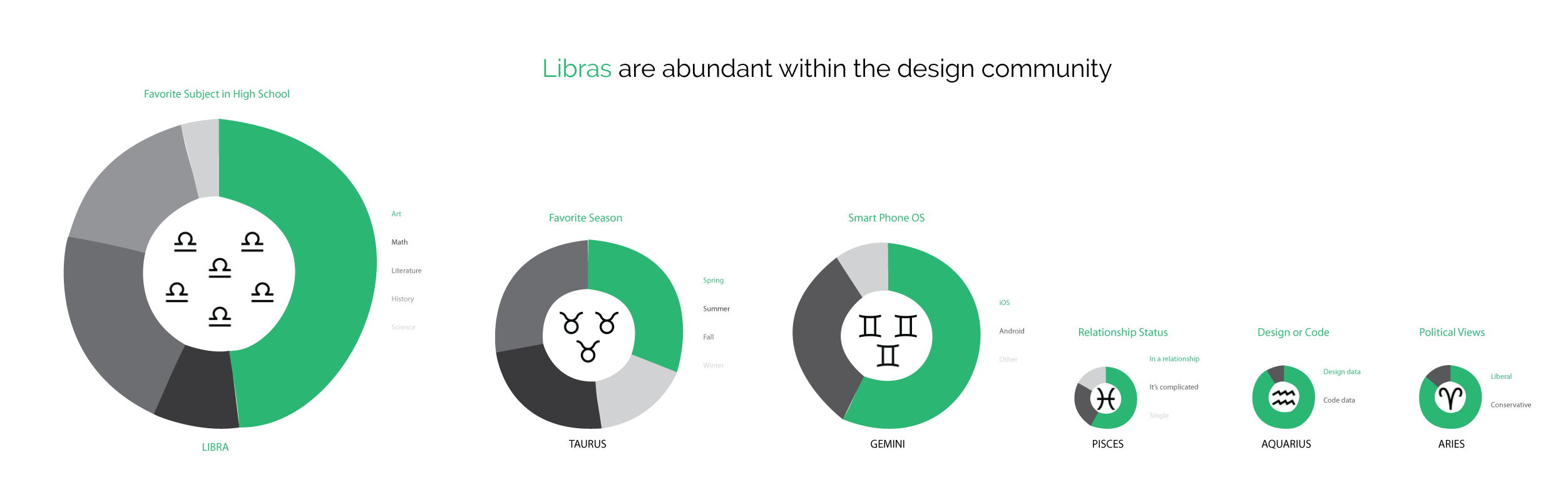
A Visualization – How Y’all, Youse and You Guys Talk
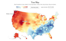
This visualization from the New York Times collects information on the user’s dialect and then maps out the areas that have the most similar and least similar dialects to the user.
Artist/Designer – Carlo Zapponi
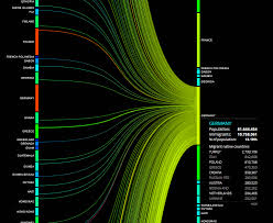
Carlo Zapponi is a visual designer in London who made “People Movin” which visualizes the number of people emigrating from each country in the world and where they are immigrating to.
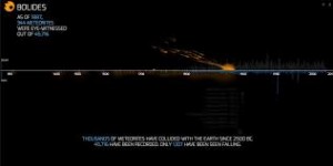
Another interesting visualization of Carlo Zapponi is called “Bolides,” which shows the number of meteors seen and recorded since 2500 BC. The visuals for Bolides are very compelling. As the visualization goes through time, small animated meteors fall onto the x-axis, representing each meteor that was recorded through time.
Visualization Tool – Modest Maps
Modest Maps provides very simple interactive maps that can be used for visualizations.
Data Collection Tool – Wrangler
Wrangler reformats messy data sets into organized tables and allows you to output the information into a variety of file formats.
Discussion Forum – Visualizing.org
Visualizing.org is an online community in which designers can discuss data visualization and showcase their own work.
Criticism – Mind the Gap – An Economic Chart Remake
Jon Schwabish of policyviz.com discusses ways in which he would improve a visualization that highlights the percentage of employed who are senior managers by gender. He provides a number of different examples that present the data in a more effective manner, including changing the orientation of the axes and the way that gender was differentiated.
Data Source – The World Data Bank
The World Data Bank has many collections of data including Gender Statistics, Health Nutrition and Population Statistics, and Education Statistics that are all accessible to anyone. Data can be filtered by country and date ranges.
Data Ethics – A Code of Ethics for Data Visualization Professionals
This article suggests that visual designer adhere to a “code of ethics” in which designers maintain an awareness of problems that may arise with visualizations they create. Designers should be aware of where their data is coming from, making sure that the sources are reliable. Designers should also be careful to correctly analyze the data and not make inaccurate assumptions. Finally designers should try their best to accurately portray the data and be open to criticism about their visualizations.
A Book – The Functional Art
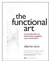
In The Functional Art, Alberto Cairo discusses what makes a data visualization particularly effective through a number of specific examples. He also talks about how and why people perceive and understand information they take in through data that is presented to them.
Research Assignment – Part 1
• Data Visualization Aggregator
Collection of data visualization/data journalism by the Guardian.
http://www.theguardian.com/news/datablog
• A visualization
UrbanSensing is a platform extracting patterns of use and citizens’ perceptions related or concerning city spaces. The platform will allow to analyze users’ perceptions related to specific geographic areas and understand how population reacts to new urban policies within participatory mechanisms.
• Artist/Designer
LUST is a multidisciplinary graphic design practice established in 1996 by Jeroen Barendse, Thomas Castro, and Dimitri Nieuwenhuizen, based in The Hague, Netherlands. LUST works in a broad spectrum of media including traditional printwork and book design, abstract cartography and data-visualisations, new media and interactive installations, and architectural graphics.
• Visualization Tool
D3 allows you to bind arbitrary data to a Document Object Model (DOM), and then apply data-driven transformations to the document.
• Data Collection Tool
Google doc
• Discussion Forum
Discussion forum for the d3 library
https://groups.google.com/forum/#!forum/d3-js
• Criticism
Everyone knows that the Internet has changed how businesses operate, governments function, and people live. But a new, less visible technological trend is just as transformative: “big data.” Big data starts with the fact that there is a lot more information floating around these days than ever before, and it is being put to extraordinary new uses. Big data is distinct from the Internet, although the Web makes it much easier to collect and share data. Big data is about more than just communication: the idea is that we can learn from a large body of information things that we could not comprehend when we used only smaller amounts.
• Data Source
U.S government census
http://www.census.gov/main/www/access.html
• Data Ethics
Or anything relating to the N.S.A really.
http://www.theguardian.com/world/the-nsa-files.
• A Book
Research Assignment – Part 1
Data Visualization Aggregator
Flowing Data
A Visualization
His And Hers Color
Artist/Designer
David McCandless
Visualization Tool
R
Data Collection Tool
SQL
Discussion Forum
r/dataisbeautiful
Criticism
Debunking Princeton
Data Source
Datablog, The Guardian
Data Ethics
How Tracking Customers In-Store Will Soon Become the Norm
A Book
Super Graphics: A Visual Guide to the Comic Book Universe
Week 1 – Research Assignment
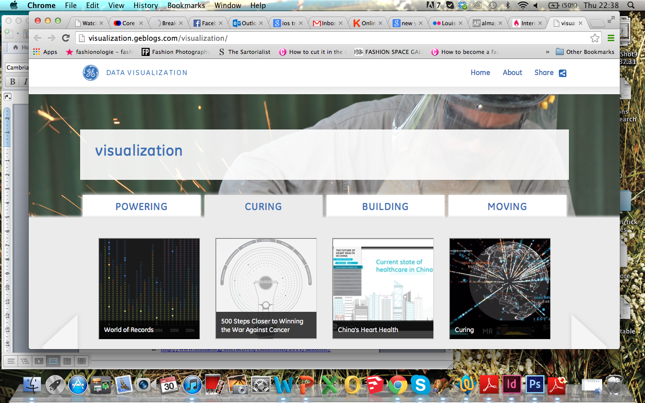
Date visualisation aggregator: GE (General Electric) believes that “data visualization is a powerful way to simplify complexity.” They display their creations under four sections: powering, curing, building and moving. http://visualization.geblogs.com/visualization/
A visualisation: made with Processing, the notes of a ballad played on the piano acts as the data used in the moving visualisation. http://www.diana-lange.de/portfolio/generative/balladen/balladen.html#navi
A designer: formerly the Data Artist in Residence at the New York Times, Jer Thorp has also been published in the Guardian and The New Yorker among others. He sometimes teaches at NYU and runs his own workshops from his studio in Brooklyn. On his website he shares source code and tutorials (Processing and ActionScript2), using his own visualisations as examples. http://blog.blprnt.com/about
TED talk: Jer Thorp – ‘Make Data More Human’ http://www.ted.com/talks/jer_thorp_make_data_more_human.html
Visualisation tool:
- http://selection.datavisualization.ch/ A ton of web services and downloadable software packages for creating visualisations.
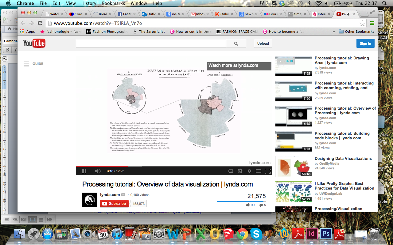
- http://www.youtube.com/watch?v=T5lRLA_Vn7o Lynda.com’s channel on Youtube has a ton of tutorials on using Processing for data visualisations specifically. They have a full online course on their website.
Data collection tool: a ton of sites and programs with which you can import and format data. http://www.visualisingdata.com/index.php/2013/09/essential-resources-tools-for-collecting-and-handling-data/
Discussion forum: over 7,000 questions regarding Processing are asked and answered by the online community. http://forum.processing.org/one/programming-questions/1.html
Criticism: “Data Visualization: It’s Pretty, but Is It Useful?” http://blogs.guggenheim.org/lablog/data-visualization-its-pretty-but-is-it-useful/
Data source: a ridiculous number of links to a huge variety of sites which hold subject-specific data e.g. government, social media, newspapers, mapping etc. http://www.visualisingdata.com/index.php/2013/07/a-big-collection-of-sites-and-services-for-accessing-data/
Data ethics: 2011 iOS tracking ‘scandal’ http://arstechnica.com/apple/2011/04/senator-questions-apple-in-wake-of-ios-tracking-scandal/
A book: ‘Interactive Data Visualization for the Web’ by Scott Murray teaches you to write code (html/css/D3). Other books in the series include guides for Python and more. Found at McNally Jackson (52 Prince Street, New York 10012). http://www.amazon.com/Interactive-Data-Visualization-Scott-Murray/dp/1449339735/ref=sr_1_1?s=books&ie=UTF8&qid=1391300328&sr=1-1&keywords=Interactive+Data+Visualization+for+the+Web
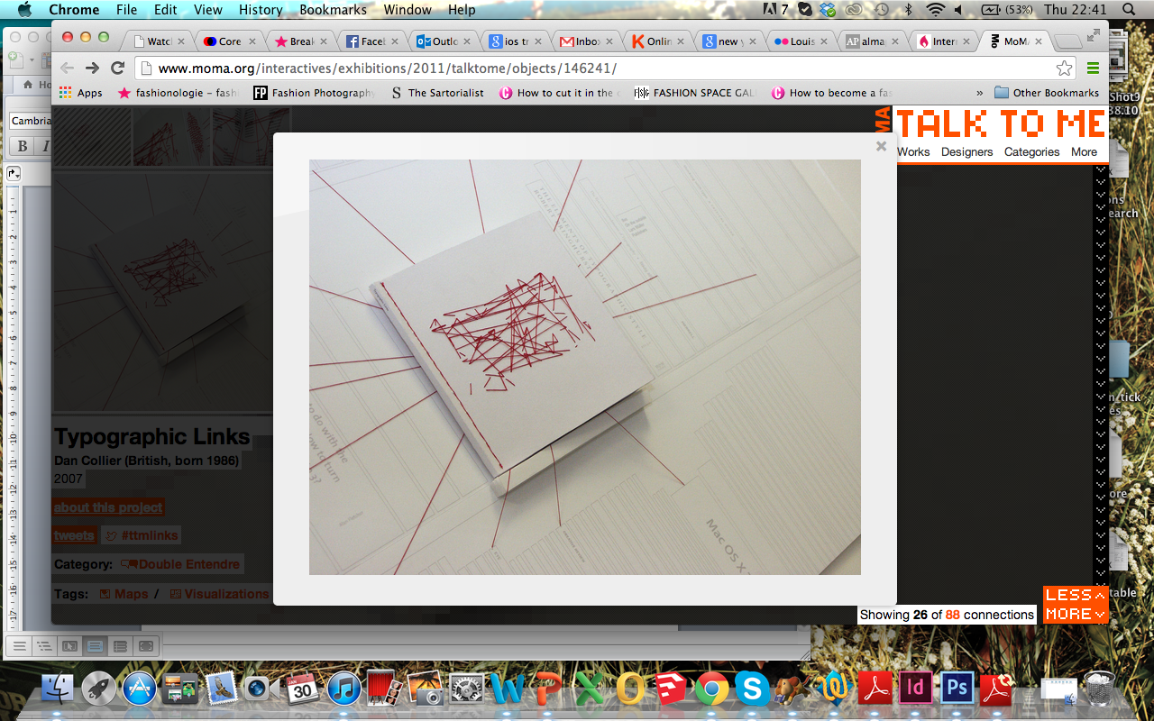
Exhibition: MoMA’s ‘Talk To Me’ (July-Nov 2011) exhibits contemporary artists and designers’ takes on communication and networking. Not all works deal with data, but some of those that do show how data visualisations aren’t limited to the screen.
- http://www.moma.org/interactives/exhibitions/2011/talktome/
- http://www.moma.org/interactives/exhibitions/2011/talktome/objects/146380/
- http://www.moma.org/interactives/exhibitions/2011/talktome/objects/146241/
Hello world!
Welcome to WordPress. This is your first post. Edit or delete it, then start blogging!