Interaction Assignment Proposal (Revised)
jayne-proposal
The subject of your web page:
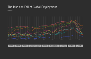
I’m interested in exploring global employment statistics and identifying employment trends through time. I’m going to present the data through a large line graph. The user will be able to click on a country of their choosing and that line in the graph will turn into an area graph and more detailed information about the selected country will appear below the menu of countries.
I’d like the user to then be able to click to see more detailed information on that specific country’s employment statistics, like unemployment numbers for men vs. women, unemployment numbers for different age groups, and the way the country’s economy is divided. It would be interesting to be able to compare one country’s unemployment numbers of women to another country’s.
The data you will use:
The data set is International Labor Comparisons from the Bureau of Labor Statistics from the United States Department of Labor. It is very detailed and shows employment data from 1970 to 2012 of the following countries: United States, Australia, Canada, France, Germany, Italy, Japan Korea, Mexico, Netherlands, New Zealand, South Africa, Spain, Sweden, Turkey and the United Kingdom.
The data set also includes employment statistics divided by different sectors of the economy (agriculture, industry, manufacturing, and services), as well as unemployment statistics divided by age group and gender. The excel file is very clear and easy to understand.
The technologies you will use:
I felt like I was getting more comfortable with javascript, but I worry about the timeline with this project. So, I think I will use processing for this project. I felt more comfortable with processing and think I could probably do more with animations and other transitions.
Identify and plan for every challenge.
Some of the data in the data set is not complete for some of the countries. However, I think I can get around that by either excluding those countries, or excluding earlier dates. Since Turkey, South Africa, and Mexico have limited data that was collected, I will likely exclude them from the visualization.
Challenges that I foresee:
Design Comp:


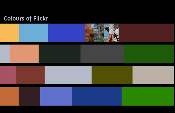
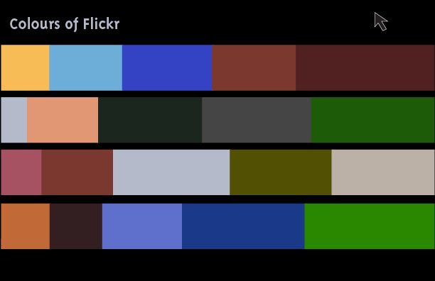
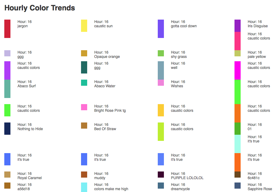
The Flickr Interestingness algorithm tracks the most interesting photos on Flickr by parameters such as “where the clickthroughs are coming from; who comments on it and when; who marks it as a favorite; its tags and many more things which are constantly changing.” Having a high “interestingness” factor is what gets a photo to the Explore page, which means more views and a higher chance of appearing in external search results.
I would like to look for and visualize the colour trends of these most interesting photos.
The subject of my web page:
I’m interested in mapping out Chicago Crime Statistics. I’m from the glorious city of Chicago and noticed a dramatic increase of crime over the last 5 years. I’m hoping that I may be able to come to some conclusions about the cause.
The data I will use:
The data set that I’m planning to use is provided by the City of Chicago to monitor chicago crime and is updated daily. The Chicago Tribune has created this API using these crime stats because the city of Chicago’s format is a little more difficult to use. The information that the API provides is the location (address, lattitude/longitude, neighborhood, ward), date, time, type of crime, description of crime, case number, whether there was an arrest, etc. The data is formatted into json, jsonp, xml, and csv.
https://data.cityofchicago.org/Public-Safety/Crimes-2001-to-present/ijzp-q8t2
http://blog.apps.chicagotribune.com/2013/03/22/announcing-the-chicago-crime-api/
My plan:
I plan to use Modest Maps (http://modestmaps.com/) to map out the city of Chicago. I will place a dot where each crime occurred. I’d like to have each type of crime mapped out on a separate map and will have a specific color dot correspond to a specific type of crime.
I’d also like to have a map that includes all types of crime so we can compare the different types and see which (if any) are more prevalent and in what areas.
A design comp of my visualization:
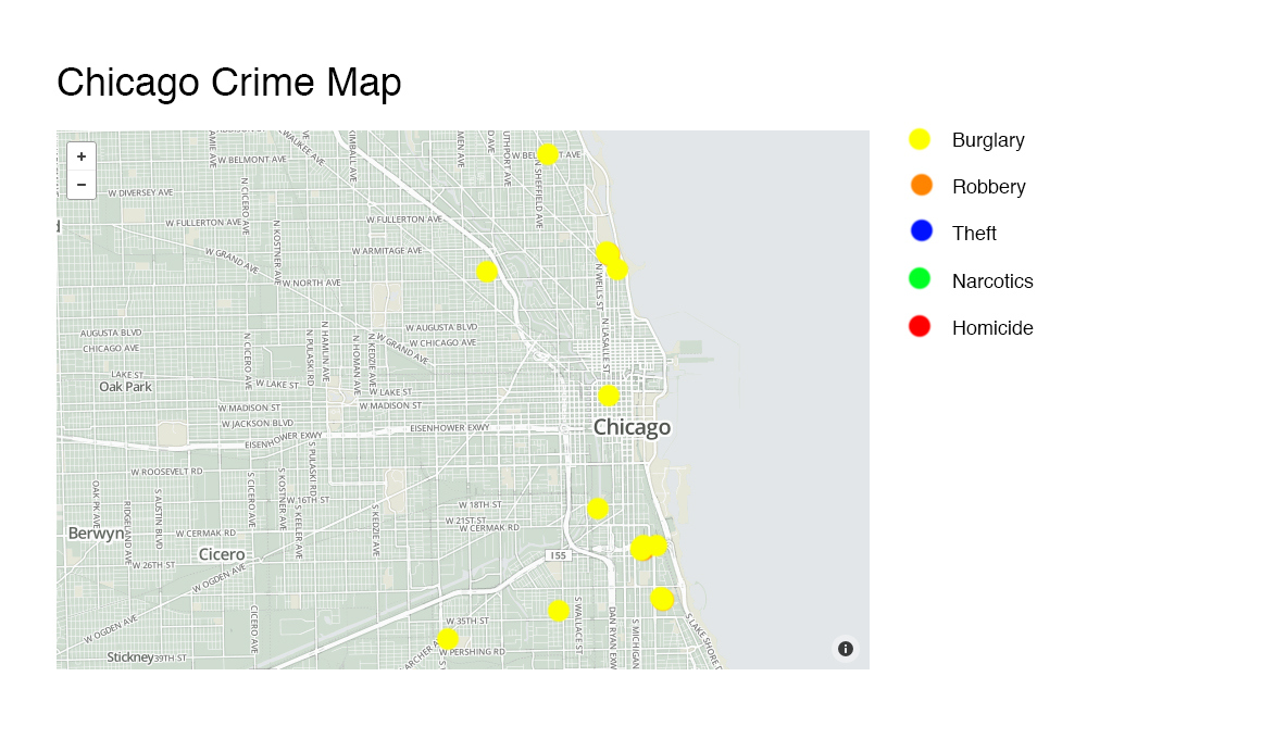
Map showing just the burglaries
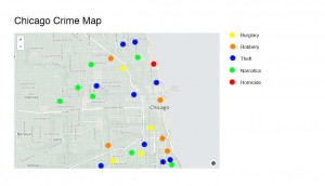
Map showing all types of crimes
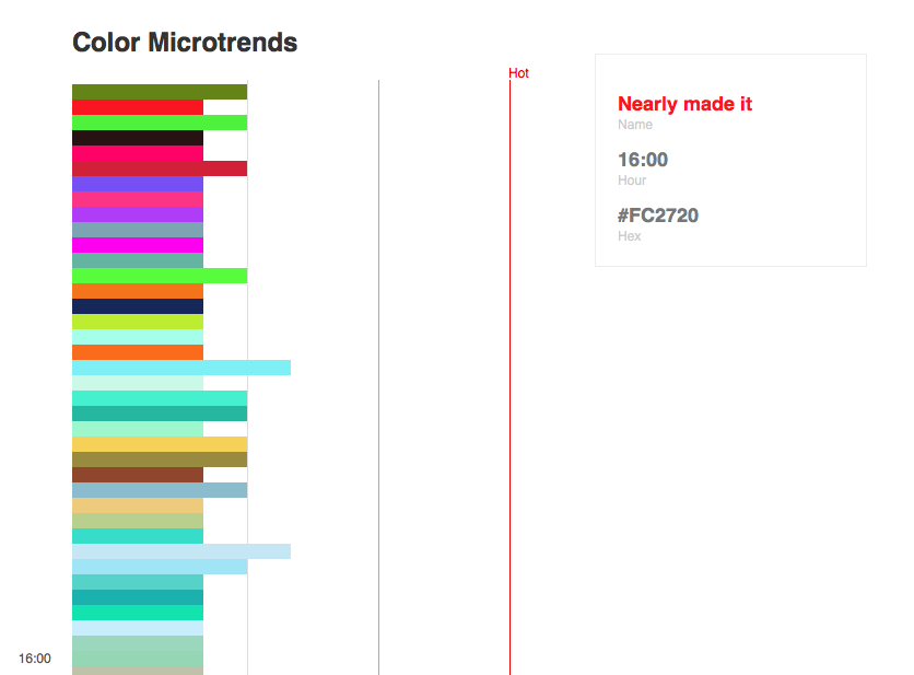
Subject: A tool for designers to identify micro-trends in colors.
Data: I found out ColourLovers has a pretty clean API.
http://www.colourlovers.com/api
Design Comp:
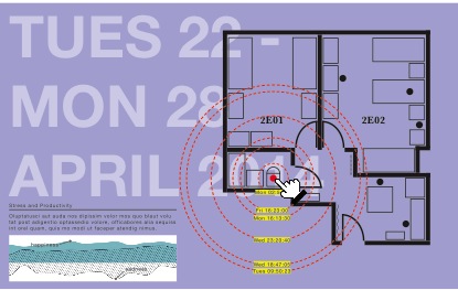
Subject: A web component for the Advance App, a personal data tracking and reccomendation system developed to promote decisive and productive behavior with technology.
Data: The website will use different ability levels linked to a collection of personal data APIs, such as:
– MyFitnessPal
– Lumosity
– Khan Academy
– Samsara
– CodeAcademy
Design Comp: A reinterpretation of the UI from the app.
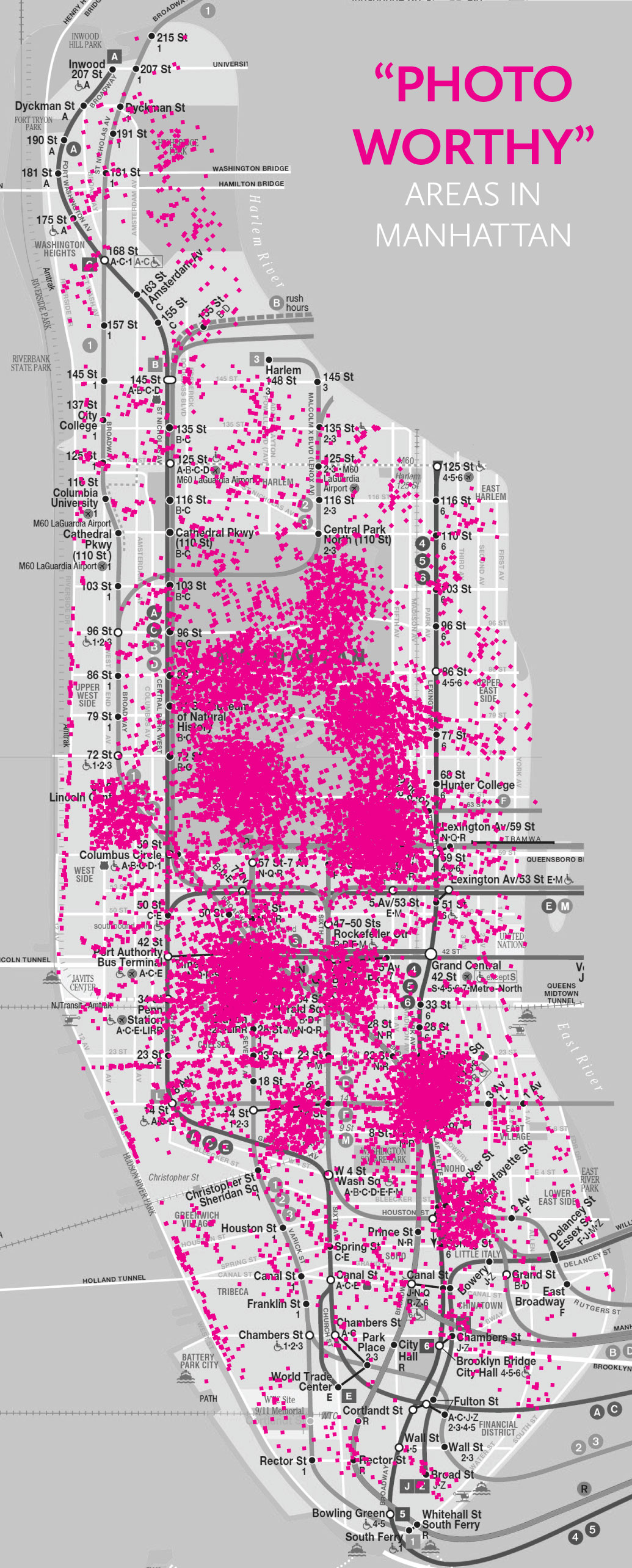
Subject:
I really wanted to use locational data from Instagram because I find it interesting to see where everyone’s photos are being taken, especially when they are extremely detailed shots. It gives a reference and helps to shape the picture in your mind of the story behind the photo. The purpose of my realtime data visualization is to show the most popular areas in the city (Manhattan only) to take photos, or is “photo-worthy”. This may influence people to go specifically to these places out of curiosity and perhaps allow more people to explore different parts of the city that they had never seen or experienced before.
Data:
Instagram API
–locations
-geographies
Design Comp:
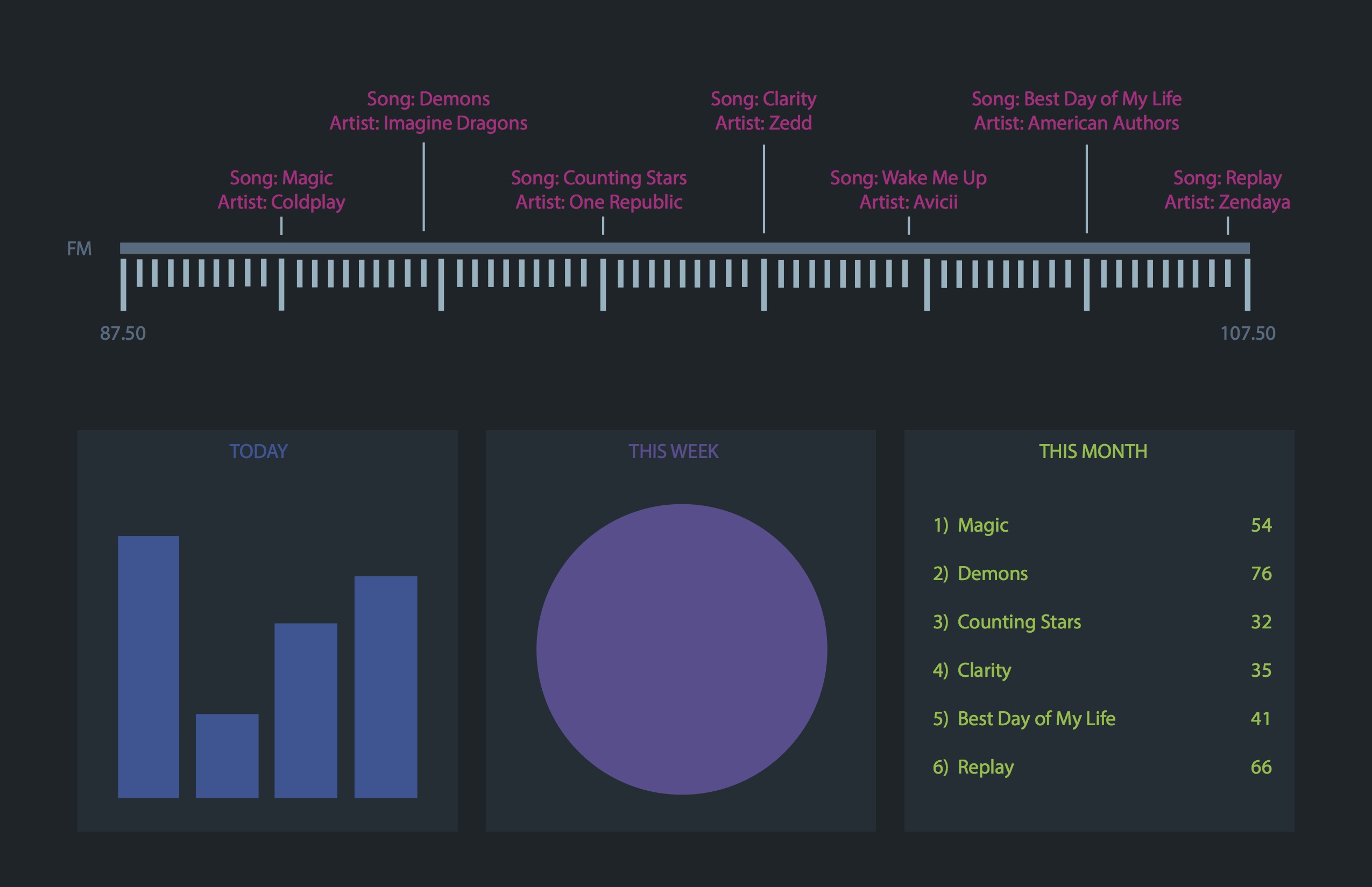
This website will show all radio stations of New York and what they are playing at that point in time. The visualization will also update daily, weekly and monthly charts indicating the top played songs and their frequency within that time period.
This data source gives real time updates of most US radio stations. http://www.programmableweb.com/api/yes-broadcast-db
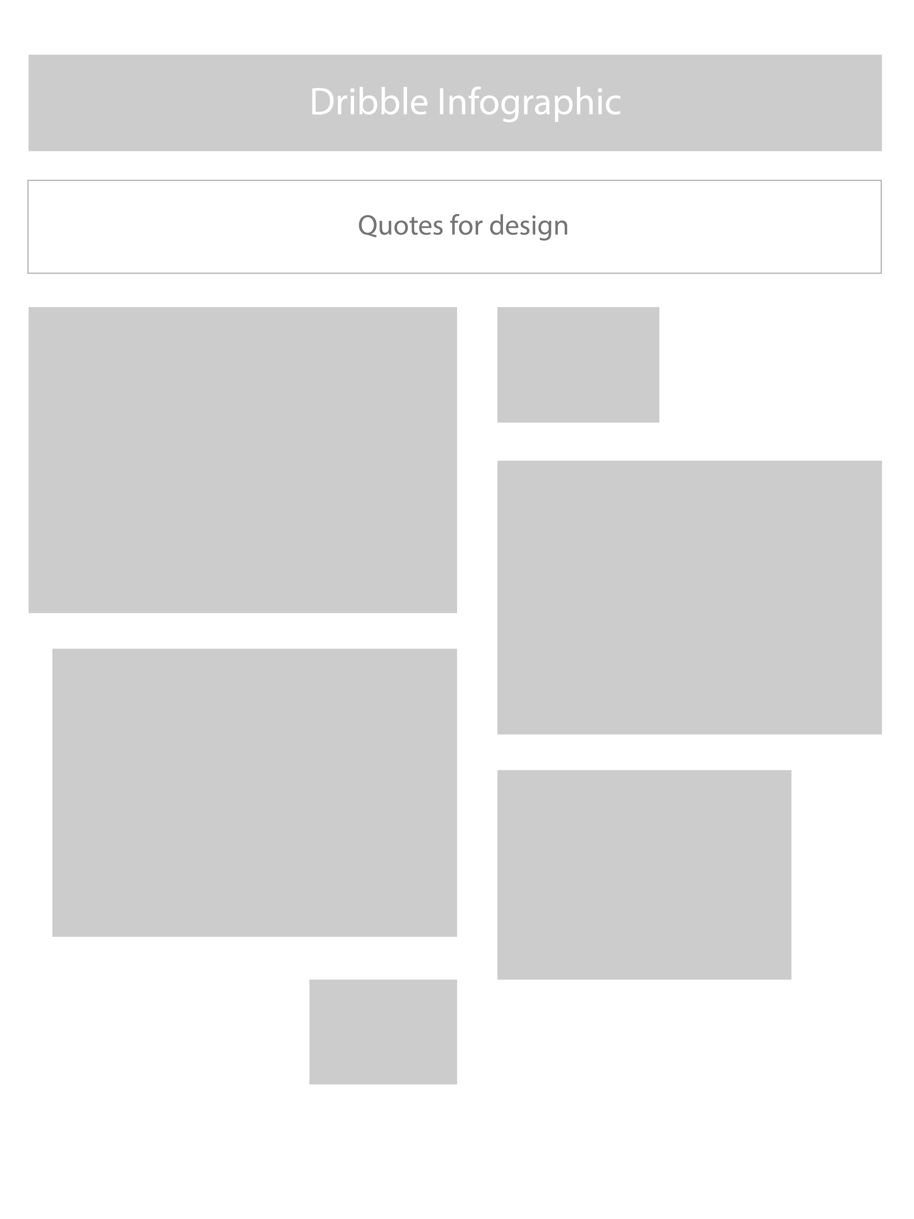
Purpose : To display Dribble artwork. The artwork will be displayed and sized according its popularity (more popular larger, less popular smaller), thus the data visualization will be made of the artworks itself. The popularity of an artwork changes frequently (at the least, daily).
Quotes on Design Resource page & API